Chart position — tracked daily by LaunchShots
Screenshot changes — detected by LaunchShots
Screenshot style breakdown
Sampled from 6 of ميزان العرب - موسوعة الشعر's App Store screenshots — background, accent and theme, measured by LaunchShots (not something Apple publishes).
#F4ECE4 bg
#D6CFC8
#AC8C4C accent
#111111 text
Reading the caption text from the screenshots in your browser…
Screenshots




Icon palette
About this app
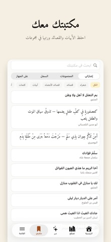
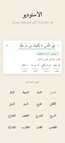
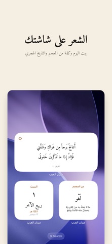
ديوانُ الشعر العربي كاملًا في جيبك — من المعلّقات إلى الشعر الحديث. أكثر من ٢٥٠ ألف قصيدة لـ ٦٨٦٩ شاعرًا، مع بحورها وقوافيها وأغراضها، ومعجمٌ كلاسيكي يتجاوز ٩٠ ألف مادة مأخوذة من لسان العرب وأخواته. • بيت اليوم وقصيدة اليوم — يبدأ يومك ببيتٍ يستحق الحفظ. • درر — بيتٌ في كل شاشة، تتصفّحها كما تتصفّح ما تحب، ومنها عدسةٌ لقصائد الأعضاء. • قارئ القصيدة — اضغط أي كلمة لتعرف معناها من المعجم، واقرأ شرح البيت. • الاستوديو — اكتب قصيدتك سطرًا سطرًا، فيُكشف بحرُ كلِّ سطرٍ وتفعيلاته لحظةَ كتابته، وتُحفظ مسوّداتك في حسابك. • انشر قصيدة — انشر قصائدك في ديوانك باختيار البحر والغرض، وتابعها من «ديواني». • دليل البحور — تعلّم العروض من مفاتيحه وتفعيلاته. • معجم الأسماء — معاني أسماء العرب وأصولها وشواهدها من الشعر. • كلمة اليوم — لعبة يومية تختبر معجمك العربي. • الودجت — بيتٌ وكلمةٌ من المعجم وتاريخٌ هجري على شاشتك، ويمكنك تثبيت أبيات بعينها لتعود إليك. • شعراء الميزان — قصائد يكتبها الأعضاء، تقرؤه…
App details
What you can learn from ميزان العرب - موسوعة الشعر
Every shipping app on the App Store has gone through the same decisions you're working through right now: which screenshot goes first, what caption sits over it, which device frame to show, what color the background should be. The 10 screenshots above are ميزان العرب - موسوعة الشعر's answers to those questions — they're public, they're real, and they made it through Apple's review.
What the numbers say: ميزان العرب - موسوعة الشعر runs a light set with one background colour (#F4ECE4) carried across every screenshot — the listing reads as a single poster when the shots sit side by side in search results. The accent colour we picked up, #AC8C4C, is the one to reuse for badges, arrows and highlighted words if you borrow this look. Hit Use this style to open the editor with these exact colours and drop your own screenshot in.
Notice the first screenshot in particular. It's the one users see in search results and on the product page, and it's where most apps spend their best caption and tightest design. Look at the proportion of background to phone, where the text sits, what one thing the image is trying to communicate.
Want to see how other Book apps approach the same problem? Browse more Book apps in the showcase.
Take what works into your own screenshots
Open LaunchShots and design your App Store & Google Play screenshots — pick a device frame, drop captions, ship in minutes. Free, in your browser.
Open the screenshot editor →Apps with a similar look
Closest background + accent colours among the listings we've analysed — useful when you want to see the same palette handled by a different team.