Chart position — tracked daily by LaunchShots
Screenshot style breakdown
Sampled from 4 of 潮時計's App Store screenshots — background, accent and theme, measured by LaunchShots (not something Apple publishes).
#0C141C bg
#2E343B
#447C8C accent
#FFFFFF text
Reading the caption text from the screenshots in your browser…
Screenshots


iPad screenshots


Icon palette
About this app
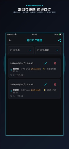
【「釣れる時間」が1分単位で見えてくる。アングラー専用カスタムタイドグラフ】 「潮見表通りに動いたのに釣れなかった…」その原因は、基準港とあなたの釣り場との間にある「ズレ(時差)」にあります。 『潮時計』は、現場の肌感覚に合わせて潮汐・流速グラフを5分単位で手動補正。さらに潮位・流速を1分単位で数値化し、リアルタイムに追従します。 【主な特徴】 ・1分刻みの潮位・流速数値化:潮が動き始める瞬間や緩む瞬間など、最高の「時合」を逃しません。 ・5分単位の現場時差補正(PRO):全国の公式基準港データと実釣ポイントとのタイムラグを簡単手動修正。 ・地図上マイポイント登録(PRO):タップするだけで緯度経度からあなただけの秘密の釣り場を最大100箇所登録。 ・潮回り自動連携「釣行ログ」(PRO):爆釣した「あの時」の潮位・流速データをグラフ上に自動記録し、再現できます。 感覚頼みの釣りを卒業し、未来の同じ潮回りを引き当てて再現するための本気のアングラー専用カスタム計器です。 ■ 利用規約(標準Apple EULA): https://ww…
App details
What you can learn from 潮時計
Every shipping app on the App Store has gone through the same decisions you're working through right now: which screenshot goes first, what caption sits over it, which device frame to show, what color the background should be. The 8 screenshots above are 潮時計's answers to those questions — they're public, they're real, and they made it through Apple's review.
What the numbers say: 潮時計 runs a dark set with one background colour (#0C141C) carried across every screenshot — the listing reads as a single poster when the shots sit side by side in search results. The accent colour we picked up, #447C8C, is the one to reuse for badges, arrows and highlighted words if you borrow this look. Hit Use this style to open the editor with these exact colours and drop your own screenshot in.
Notice the first screenshot in particular. It's the one users see in search results and on the product page, and it's where most apps spend their best caption and tightest design. Look at the proportion of background to phone, where the text sits, what one thing the image is trying to communicate.
Want to see how other Weather apps approach the same problem? Browse more Weather apps in the showcase.
Take what works into your own screenshots
Open LaunchShots and design your App Store & Google Play screenshots — pick a device frame, drop captions, ship in minutes. Free, in your browser.
Open the screenshot editor →Apps with a similar look
Closest background + accent colours among the listings we've analysed — useful when you want to see the same palette handled by a different team.