Chart position — tracked daily by LaunchShots
Screenshot style breakdown
Sampled from 6 of 接小人上车-逃出孤岛's App Store screenshots — background, accent and theme, measured by LaunchShots (not something Apple publishes).
#243C54 bg
#42576B
#740C14 accent
#FFFFFF text
Reading the caption text from the screenshots in your browser…
Screenshots




Icon palette
About this app
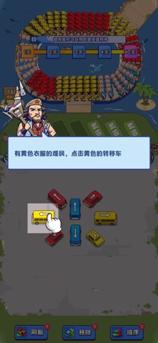
孤岛危机蔓延,无数受困者亟待营救,联盟正式征召你成为救援水手,奔赴孤岛开启救援行动。 救援规则须知:依据难民衣着色彩划分转运组别,精准分流是救援关键。身穿黄色衣衫的难民,必须送入对应黄色车辆进行转移接送。吹响哨子便能更改难民移动快慢节奏,每一辆转运车拥有专属载客上限,需要你统筹安排、把控节奏。 合理调度车队,有序安置所有被困难民,顺利完成整场孤岛救援任务。
App details
What you can learn from 接小人上车-逃出孤岛
Every shipping app on the App Store has gone through the same decisions you're working through right now: which screenshot goes first, what caption sits over it, which device frame to show, what color the background should be. The 6 screenshots above are 接小人上车-逃出孤岛's answers to those questions — they're public, they're real, and they made it through Apple's review.
What the numbers say: 接小人上车-逃出孤岛 runs a mixed light-and-dark set where the background shifts from screenshot to screenshot (first shot #243C54) — each image has to stand on its own, so the captions carry more of the story. The accent colour we picked up, #740C14, is the one to reuse for badges, arrows and highlighted words if you borrow this look. Hit Use this style to open the editor with these exact colours and drop your own screenshot in.
Notice the first screenshot in particular. It's the one users see in search results and on the product page, and it's where most apps spend their best caption and tightest design. Look at the proportion of background to phone, where the text sits, what one thing the image is trying to communicate.
Want to see how other Games apps approach the same problem? Browse more Games apps in the showcase.
Take what works into your own screenshots
Open LaunchShots and design your App Store & Google Play screenshots — pick a device frame, drop captions, ship in minutes. Free, in your browser.
Open the screenshot editor →Apps with a similar look
Closest background + accent colours among the listings we've analysed — useful when you want to see the same palette handled by a different team.