Chart position — tracked daily by LaunchShots
Screenshot style breakdown
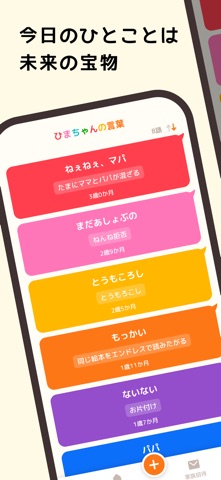
Sampled from 6 of しゃべろぐ's App Store screenshots — background, accent and theme, measured by LaunchShots (not something Apple publishes).
#FCFCE4 bg
#DDDDC8
#944CCC accent
#111111 text
Reading the caption text from the screenshots in your browser…
Screenshots


Icon palette
About this app
写真や動画を残すように、言葉を話した瞬間の感動も残したい。0〜6歳頃までのお子さまのはじめての言葉や心に残った言葉、可愛い言い間違いをかんたんに記録。夫婦間や、遠く離れて暮らすおじいちゃんおばあちゃんにも、リアルタイムで言葉の成長を共有できます。 今しか聞けない言葉を、未来の宝物として残しませんか? 【しゃべろぐでできること】 ■ 子どもの言葉をかんたん記録 忙しい育児の合間でも、気づいた時にサッと記録。かけがえのない瞬間を簡単に残せます。 ■ 言葉が可愛いカードに 記録した言葉は、カラフルで可愛いカード形式で表示。増えていく言葉を眺めながら、お子さまの成長を楽しく振り返れます。 ■ 安心・安全の家族共有 招待した家族だけが参加できる安心の共有機能。夫婦間や、離れて暮らすおじいちゃん・おばあちゃんにも、感動を共有できます。 ■SNSシェア 「これはみんなに見せたい!」そんな可愛い言葉を、言葉カードにしてSNSで簡単にシェアできます。 ■意味やメモも一緒に記録 「ブーブー=車」などの幼児語の意味やメモもまとめ…
App details
What you can learn from しゃべろぐ
Every shipping app on the App Store has gone through the same decisions you're working through right now: which screenshot goes first, what caption sits over it, which device frame to show, what color the background should be. The 6 screenshots above are しゃべろぐ's answers to those questions — they're public, they're real, and they made it through Apple's review.
What the numbers say: しゃべろぐ runs a light set with one background colour (#FCFCE4) carried across every screenshot — the listing reads as a single poster when the shots sit side by side in search results. The accent colour we picked up, #944CCC, is the one to reuse for badges, arrows and highlighted words if you borrow this look. Hit Use this style to open the editor with these exact colours and drop your own screenshot in.
Notice the first screenshot in particular. It's the one users see in search results and on the product page, and it's where most apps spend their best caption and tightest design. Look at the proportion of background to phone, where the text sits, what one thing the image is trying to communicate.
Want to see how other Lifestyle apps approach the same problem? Browse more Lifestyle apps in the showcase.
Take what works into your own screenshots
Open LaunchShots and design your App Store & Google Play screenshots — pick a device frame, drop captions, ship in minutes. Free, in your browser.
Open the screenshot editor →Apps with a similar look
Closest background + accent colours among the listings we've analysed — useful when you want to see the same palette handled by a different team.