Chart position — tracked daily by LaunchShots
Screenshot style breakdown
Sampled from 6 of Boon - önskelista & presenter's App Store screenshots — background, accent and theme, measured by LaunchShots (not something Apple publishes).
#FCECFC bg
#DDCFDD
#FCA484 accent
#111111 text
Screenshots
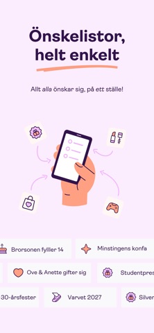
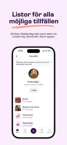
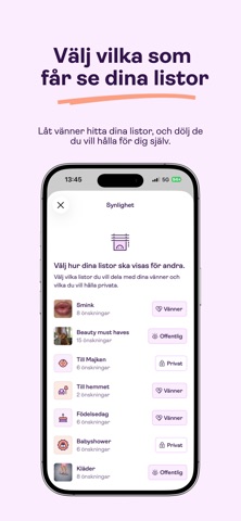
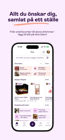
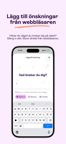

iPad screenshots


Icon palette
About this app
Allt alla önskar sig, på ett ställe. Boon samlar det du önskar dig från vilken butik som helst i en önskelista som är lätt att dela med familjen, kompisgänget eller den som alltid frågar "vad önskar du dig?" tre dagar innan. Rätt present till rätt person, utan tjat och utan dubbletter. Så funkar Boon - Lägg till önskningar från alla butiker - klistra in en länk, så hämtar Boon bild och pris - Skapa flera önskelistor: julklappar, födelsedag, bröllop, babyshower eller "en vacker dag" - Dela din lista med familj och vänner! De ser vad du önskar dig, du slipper fråga och de slipper gissa - Skapa en gemensam lista som ni fyller på ihop, inför bröllopet, festen eller resan - Reservera presenten du tänker ge - alla ser vad som redan är taget, och ingen kommer med samma paket - Följ familj och vänner och se vad de faktiskt önskar sig - presenten blir rätt utan att du behöver fråga - Vet du in…
App details
What you can learn from Boon - önskelista & presenter
Every shipping app on the App Store has gone through the same decisions you're working through right now: which screenshot goes first, what caption sits over it, which device frame to show, what color the background should be. The 9 screenshots above are Boon - önskelista & presenter's answers to those questions — they're public, they're real, and they made it through Apple's review.
What the numbers say: Boon - önskelista & presenter runs a light set with one background colour (#FCECFC) carried across every screenshot — the listing reads as a single poster when the shots sit side by side in search results. The accent colour we picked up, #FCA484, is the one to reuse for badges, arrows and highlighted words if you borrow this look. Hit Use this style to open the editor with these exact colours and drop your own screenshot in.
Notice the first screenshot in particular. It's the one users see in search results and on the product page, and it's where most apps spend their best caption and tightest design. Look at the proportion of background to phone, where the text sits, what one thing the image is trying to communicate.
Want to see how other Lifestyle apps approach the same problem? Browse more Lifestyle apps in the showcase.
Take what works into your own screenshots
Open LaunchShots and design your App Store & Google Play screenshots — pick a device frame, drop captions, ship in minutes. Free, in your browser.
Open the screenshot editor →Apps with a similar look
Closest background + accent colours among the listings we've analysed — useful when you want to see the same palette handled by a different team.