Chart position — tracked daily by LaunchShots
Screenshot style breakdown
Sampled from 5 of Toffe's App Store screenshots — background, accent and theme, measured by LaunchShots (not something Apple publishes).
#DCFC1C bg
#C1DD18
#546404 accent
#111111 text
Reading the caption text from the screenshots in your browser…
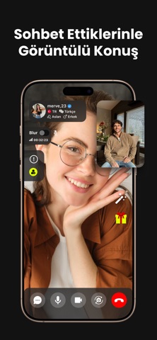
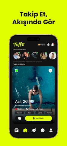
Screenshots



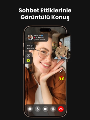
iPad screenshots



Icon palette
About this app
Toffe, fikirlerin bir araya geldiği anket temelli bir sosyal topluluk uygulamasıdır. Merak ettiğin soruyu sor, topluluğun ne düşündüğünü gör — sonuçlar sen oy vermeden açılmaz, böylece her cevap gerçek bir fikri yansıtır. ANKETLER Uygulama bir anket akışıyla açılır. Kendi anketini saniyeler içinde oluştur: seçeneklerini yaz, kategorisini seç, dilersen süre belirle. İlgini çeken sorulara oy ver — yüzdeler sadece oy verenlere açılır. TOPLULUK İlgi alanlarına göre yeni anketler ve gündemler keşfet. Sorularını beğendiğin üyeleri takip et, yeni anketlerini kaçırma. Oy verdiğin anketler üzerine üyelerle fikir alışverişi yap. ÖNCE GÜVENLİK • Engelleme ve şikayet araçları profillerde ve sohbetlerde her zaman bir dokunuş uzağında. • Kimlerin sana mesaj gönderebileceğini ve arama alıp almayacağını Ayarlar > Gizlilik'ten sen belirlersin. • Sesli ve görüntülü aramalar sadece birbiriyle mesajlaşm…
App details
What you can learn from Toffe
Every shipping app on the App Store has gone through the same decisions you're working through right now: which screenshot goes first, what caption sits over it, which device frame to show, what color the background should be. The 10 screenshots above are Toffe's answers to those questions — they're public, they're real, and they made it through Apple's review.
What the numbers say: Toffe runs a mixed light-and-dark set where the background shifts from screenshot to screenshot (first shot #DCFC1C) — each image has to stand on its own, so the captions carry more of the story. The accent colour we picked up, #546404, is the one to reuse for badges, arrows and highlighted words if you borrow this look. Hit Use this style to open the editor with these exact colours and drop your own screenshot in.
Notice the first screenshot in particular. It's the one users see in search results and on the product page, and it's where most apps spend their best caption and tightest design. Look at the proportion of background to phone, where the text sits, what one thing the image is trying to communicate.
Want to see how other Social Networking apps approach the same problem? Browse more Social Networking apps in the showcase.
Take what works into your own screenshots
Open LaunchShots and design your App Store & Google Play screenshots — pick a device frame, drop captions, ship in minutes. Free, in your browser.
Open the screenshot editor →Apps with a similar look
Closest background + accent colours among the listings we've analysed — useful when you want to see the same palette handled by a different team.