Chart position — tracked daily by LaunchShots
Screenshot style breakdown
Sampled from 5 of リアルタクシーメーター's App Store screenshots — background, accent and theme, measured by LaunchShots (not something Apple publishes).
#0C1424 bg
#2E3442
#1C3C84 accent
#FFFFFF text
Screenshots


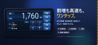
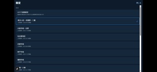
iPad screenshots

Icon palette
About this app
GPSタクシーメーター|Taxi-Board は、スマートフォンのGPSで走行距離と時間を計測し、まるで本物のタクシーメーターのように運賃の目安を表示するメーター体験アプリです。 実際のタクシーメーターをイメージした、大きく見やすい画面。走行中でもサッと押せる大きなボタンで、必要な操作をすばやく行えます。歩き・自転車・電車など、移動すればするほどメーターがぐんぐん伸びていく感覚を楽しめます。 ■ 主な機能 ・GPS連動メーター:距離と時間を自動計測し、運賃の目安をリアルタイム表示 ・主要エリア対応:東京・大阪・名古屋・京都・神戸・福岡・札幌などの運賃設定に対応 ・着せ替え5種類:ブルーパネル/クラシックLED/シアンコックピット/ホワイトミニマル/ブルーインストゥルメント。気分で見た目を切り替え ・状態をワンタップ:空車・実車・支払・迎車をボタンで切り替え ・割増・高速に対応:深夜/早朝の割増や高速利用もかんたん操作 ・走行距離・経過時間表示:いまどれだけ走ったかが一目でわかる ■ こんな方に ・タクシーメーターの動きや…
App details
What you can learn from リアルタクシーメーター
Every shipping app on the App Store has gone through the same decisions you're working through right now: which screenshot goes first, what caption sits over it, which device frame to show, what color the background should be. The 6 screenshots above are リアルタクシーメーター's answers to those questions — they're public, they're real, and they made it through Apple's review.
What the numbers say: リアルタクシーメーター runs a dark set with one background colour (#0C1424) carried across every screenshot — the listing reads as a single poster when the shots sit side by side in search results. The accent colour we picked up, #1C3C84, is the one to reuse for badges, arrows and highlighted words if you borrow this look. Hit Use this style to open the editor with these exact colours and drop your own screenshot in.
Notice the first screenshot in particular. It's the one users see in search results and on the product page, and it's where most apps spend their best caption and tightest design. Look at the proportion of background to phone, where the text sits, what one thing the image is trying to communicate.
Want to see how other Utilities apps approach the same problem? Browse more Utilities apps in the showcase.
Take what works into your own screenshots
Open LaunchShots and design your App Store & Google Play screenshots — pick a device frame, drop captions, ship in minutes. Free, in your browser.
Open the screenshot editor →Apps with a similar look
Closest background + accent colours among the listings we've analysed — useful when you want to see the same palette handled by a different team.