Chart position — tracked daily by LaunchShots
Screenshot changes — detected by LaunchShots
Screenshot style breakdown
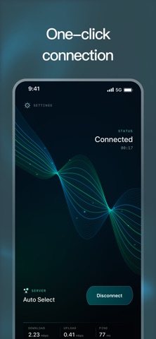
Sampled from 4 of VPNВПН2027's App Store screenshots — background, accent and theme, measured by LaunchShots (not something Apple publishes).
#04141C bg
#27343B
#345464 accent
#FFFFFF text
Reading the caption text from the screenshots in your browser…
Screenshots



Icon palette
About this app
VPN Super is a lightweight VPN connection app designed for simple, clear, and reliable daily use. With a focused interface and smooth visual design, VPN Super makes it easy to start or stop a VPN connection, choose a preferred server option, and review basic network status information in one place. Main Features: • One-tap VPN connection: connect or disconnect with a simple and direct control • Server selection: choose Auto Select or select from available server locations • Network Check: review basic internet access, request status, IPv4/IPv6 support, DNS availability, and current connection context • Device Info: view useful device and app information such as system version, language, network type, VPN status, and device identifier • Multi-language support: switch between English, Russian, Spanish, Portuguese, French, and German • Clean visual experience: a modern interface with smo…
App details
What you can learn from VPNВПН2027
Every shipping app on the App Store has gone through the same decisions you're working through right now: which screenshot goes first, what caption sits over it, which device frame to show, what color the background should be. The 4 screenshots above are VPNВПН2027's answers to those questions — they're public, they're real, and they made it through Apple's review.
What the numbers say: VPNВПН2027 runs a dark set where the background shifts from screenshot to screenshot (first shot #04141C) — each image has to stand on its own, so the captions carry more of the story. The accent colour we picked up, #345464, is the one to reuse for badges, arrows and highlighted words if you borrow this look. Hit Use this style to open the editor with these exact colours and drop your own screenshot in.
Notice the first screenshot in particular. It's the one users see in search results and on the product page, and it's where most apps spend their best caption and tightest design. Look at the proportion of background to phone, where the text sits, what one thing the image is trying to communicate.
Want to see how other Productivity apps approach the same problem? Browse more Productivity apps in the showcase.
Take what works into your own screenshots
Open LaunchShots and design your App Store & Google Play screenshots — pick a device frame, drop captions, ship in minutes. Free, in your browser.
Open the screenshot editor →Apps with a similar look
Closest background + accent colours among the listings we've analysed — useful when you want to see the same palette handled by a different team.