Chart position — tracked daily by LaunchShots
Screenshot style breakdown
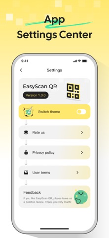
Sampled from 6 of EasyScan QR - QR Scanning's App Store screenshots — background, accent and theme, measured by LaunchShots (not something Apple publishes).
#FCFCFC bg
#DDDDDD
#FCEC8C accent
#111111 text
Screenshots


Icon palette
About this app
EasyScan QRは、QRコードのスキャン、作成、テキスト認識を1つの使いやすいアプリで実現します。 カメラでQRコードを瞬時にスキャンするか、フォトライブラリから画像をインポートできます。スキャン後、結果を確認し、開く、コピー、共有、保存など、次の操作を選択できます。 テキスト、ウェブサイトのリンク、Wi-Fiアクセス、メール、電話、SMSメッセージ、連絡先カード、場所など、日常生活のさまざまな用途に合わせてQRコードを作成できます。 EasyScan QRにはOCRテキスト認識機能も搭載されています。カメラでテキストを読み取り、抽出結果を確認して、必要なときに共有できます。 最近スキャンしたコードと作成したコードはすべて履歴に保存されるため、過去の結果を簡単に見つけることができます。 リンクの共有、Wi-Fiへの接続、連絡先情報の保存、ドキュメントからのテキスト抽出など、EasyScan QRはあらゆる操作をシンプルかつ分かりやすくします。
App details
What you can learn from EasyScan QR - QR Scanning
Every shipping app on the App Store has gone through the same decisions you're working through right now: which screenshot goes first, what caption sits over it, which device frame to show, what color the background should be. The 6 screenshots above are EasyScan QR - QR Scanning's answers to those questions — they're public, they're real, and they made it through Apple's review.
What the numbers say: EasyScan QR - QR Scanning runs a light set with one background colour (#FCFCFC) carried across every screenshot — the listing reads as a single poster when the shots sit side by side in search results. The accent colour we picked up, #FCEC8C, is the one to reuse for badges, arrows and highlighted words if you borrow this look. Hit Use this style to open the editor with these exact colours and drop your own screenshot in.
Notice the first screenshot in particular. It's the one users see in search results and on the product page, and it's where most apps spend their best caption and tightest design. Look at the proportion of background to phone, where the text sits, what one thing the image is trying to communicate.
Want to see how other Utilities apps approach the same problem? Browse more Utilities apps in the showcase.
Take what works into your own screenshots
Open LaunchShots and design your App Store & Google Play screenshots — pick a device frame, drop captions, ship in minutes. Free, in your browser.
Open the screenshot editor →Apps with a similar look
Closest background + accent colours among the listings we've analysed — useful when you want to see the same palette handled by a different team.