Chart position — tracked daily by LaunchShots
Screenshot style breakdown
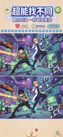
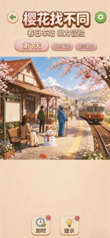
Sampled from 3 of 一眼找到底's App Store screenshots — background, accent and theme, measured by LaunchShots (not something Apple publishes).
#ECD4B4 bg
#CFBA9E
#BC9C6C accent
#111111 text
Reading the caption text from the screenshots in your browser…
Screenshots

Icon palette
About this app
海量精美手绘场景轮番登场,樱花街巷、河畔野餐、雨后花铺,每一帧都是温柔治愈的风景画,游戏内含限时寻物与对比找不同两大核心玩法,限定时间内在细腻丰富的画面搜寻隐藏目标,或是比对两张相似图画找出暗藏细节差异,不断挑战你的观察力与专注力;清新柔和的手绘美术搭配持续更新的四季小镇关卡,上千道关卡循序渐进,适配所有玩家,完成每日任务、解锁季节收集册即可领取丰厚奖励,贴心准备提示、加时道具,卡关轻松突破,没有紧绷的游玩压力,随时随地开启一局,利用碎片时光放松身心,放慢脚步徜徉春日风光,用善于发现的眼睛探寻小镇里藏着的所有惊喜。
App details
What you can learn from 一眼找到底
Every shipping app on the App Store has gone through the same decisions you're working through right now: which screenshot goes first, what caption sits over it, which device frame to show, what color the background should be. The 3 screenshots above are 一眼找到底's answers to those questions — they're public, they're real, and they made it through Apple's review.
What the numbers say: 一眼找到底 runs a light set with one background colour (#ECD4B4) carried across every screenshot — the listing reads as a single poster when the shots sit side by side in search results. The accent colour we picked up, #BC9C6C, is the one to reuse for badges, arrows and highlighted words if you borrow this look. Hit Use this style to open the editor with these exact colours and drop your own screenshot in.
Notice the first screenshot in particular. It's the one users see in search results and on the product page, and it's where most apps spend their best caption and tightest design. Look at the proportion of background to phone, where the text sits, what one thing the image is trying to communicate.
Want to see how other Games apps approach the same problem? Browse more Games apps in the showcase.
Take what works into your own screenshots
Open LaunchShots and design your App Store & Google Play screenshots — pick a device frame, drop captions, ship in minutes. Free, in your browser.
Open the screenshot editor →Apps with a similar look
Closest background + accent colours among the listings we've analysed — useful when you want to see the same palette handled by a different team.