Chart position — tracked daily by LaunchShots
Screenshot style breakdown
Sampled from 6 of Побег от ЧунгаЧанги's App Store screenshots — background, accent and theme, measured by LaunchShots (not something Apple publishes).
#1C0C04 bg
#3B2E27
#7C3404 accent
#FFFFFF text
Screenshots


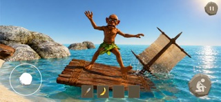
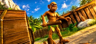
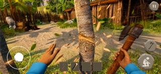
iPad screenshots
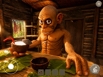



Icon palette
About this app
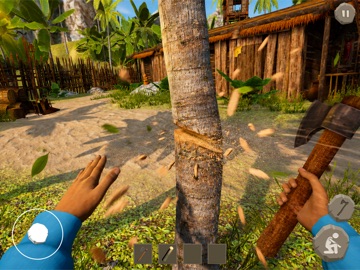
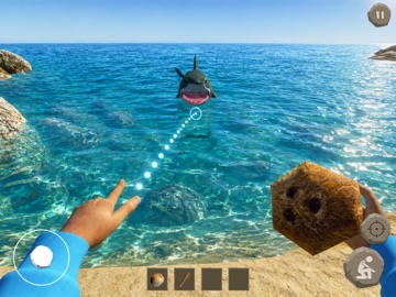
Побег от ЧунгаЧанги — это безумный хоррор на выживание с элементами головоломок, поиском выхода и огромным количеством треша, абсурда и смешных ситуаций! После загадочного кораблекрушения ты оказываешься на далеком необитаемом острове, затерянном где-то посреди океана. Связи нет. Помощи ждать неоткуда. Вокруг только густые джунгли, странные тотемы, заброшенные хижины и ощущение, что за тобой кто-то наблюдает. И очень скоро ты понимаешь — на острове ты не один. Здесь живет ЧунгаЧанга — странный абориген с пугающей улыбкой, огромными глазами и совершенно непредсказуемым поведением. Иногда он выглядит дружелюбным, иногда — крайне опасным, а иногда просто занимается максимально абсурдными вещами. Никогда не угадаешь, что он будет делать в следующую минуту: смотреть каменный телевизор, танцевать у костра или искать еду в древнем холодильнике… Теперь твоя задача — выжить и найти способ сбе…
App details
What you can learn from Побег от ЧунгаЧанги
Every shipping app on the App Store has gone through the same decisions you're working through right now: which screenshot goes first, what caption sits over it, which device frame to show, what color the background should be. The 12 screenshots above are Побег от ЧунгаЧанги's answers to those questions — they're public, they're real, and they made it through Apple's review.
What the numbers say: Побег от ЧунгаЧанги runs a mixed light-and-dark set where the background shifts from screenshot to screenshot (first shot #1C0C04) — each image has to stand on its own, so the captions carry more of the story. The accent colour we picked up, #7C3404, is the one to reuse for badges, arrows and highlighted words if you borrow this look. Hit Use this style to open the editor with these exact colours and drop your own screenshot in.
Notice the first screenshot in particular. It's the one users see in search results and on the product page, and it's where most apps spend their best caption and tightest design. Look at the proportion of background to phone, where the text sits, what one thing the image is trying to communicate.
Want to see how other Games apps approach the same problem? Browse more Games apps in the showcase.
Take what works into your own screenshots
Open LaunchShots and design your App Store & Google Play screenshots — pick a device frame, drop captions, ship in minutes. Free, in your browser.
Open the screenshot editor →Apps with a similar look
Closest background + accent colours among the listings we've analysed — useful when you want to see the same palette handled by a different team.