Chart position — tracked daily by LaunchShots
Screenshot style breakdown
Sampled from 6 of Steam & Steel's App Store screenshots — background, accent and theme, measured by LaunchShots (not something Apple publishes).
#440404 bg
#5E2727
#B45404 accent
#FFFFFF text
Screenshots




Icon palette
About this app
Een fluit klinkt, je locomotief vertrekt van het station en een vers lint spoor voert hem over een rivier naar de volgende stad. Steam & Steel is een gezellige steampunk-spoorweg die je in je eigen tempo opbouwt. Leg lijnen aan tussen uurwerksteden, sla bruggen over rivieren en boor tunnels door bergen, en ga daarna naar het depot om vijf locomotiefklassen te kopen en te verbeteren, van de dappere Pioneer tot de machtige Leviathan. Zet een trein op een route, kies zijn lading passagiers, erts, hout of post, en int je goud zodra hij aankomt - drukke routes blijven zelfs verdienen terwijl je weg bent. Neem tijdgebonden opdrachten aan voor een bonus, klim een groeiende zevendaagse beloningsreeks op, breid de Emporium-verbeterboom uit voor snellere locomotieven en ruimere stations, en ontgrendel mijlpalen terwijl een hele regio tot leven komt. Voor één speler en volledig offline, zonder rec…
App details
What you can learn from Steam & Steel
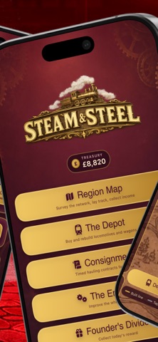
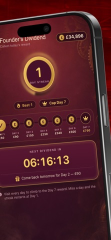
Every shipping app on the App Store has gone through the same decisions you're working through right now: which screenshot goes first, what caption sits over it, which device frame to show, what color the background should be. The 7 screenshots above are Steam & Steel's answers to those questions — they're public, they're real, and they made it through Apple's review.
What the numbers say: Steam & Steel runs a mixed light-and-dark set where the background shifts from screenshot to screenshot (first shot #440404) — each image has to stand on its own, so the captions carry more of the story. The accent colour we picked up, #B45404, is the one to reuse for badges, arrows and highlighted words if you borrow this look. Hit Use this style to open the editor with these exact colours and drop your own screenshot in.
Notice the first screenshot in particular. It's the one users see in search results and on the product page, and it's where most apps spend their best caption and tightest design. Look at the proportion of background to phone, where the text sits, what one thing the image is trying to communicate.
Want to see how other Games apps approach the same problem? Browse more Games apps in the showcase.
Take what works into your own screenshots
Open LaunchShots and design your App Store & Google Play screenshots — pick a device frame, drop captions, ship in minutes. Free, in your browser.
Open the screenshot editor →Apps with a similar look
Closest background + accent colours among the listings we've analysed — useful when you want to see the same palette handled by a different team.