Chart position — tracked daily by LaunchShots
Screenshot style breakdown
Sampled from 6 of Cuoii - Plan Your Wedding's App Store screenshots — background, accent and theme, measured by LaunchShots (not something Apple publishes).
#FCFCF4 bg
#DDDDD6
#6C1414 accent
#111111 text
Reading the caption text from the screenshots in your browser…
Screenshots
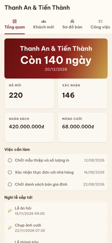


iPad screenshots


Icon palette
About this app
Cuoii là không gian tiếng Việt cho hành trình yêu, cưới và những kỷ niệm quan trọng. LẬP KẾ HOẠCH CƯỚI RÕ RÀNG • Tạo Dự án cưới để theo dõi việc cần làm, nghi lễ, khách mời, RSVP, sơ đồ bàn và các đầu việc cùng gia đình hoặc cộng tác viên. • Ghi chép ngân sách, lịch thanh toán, nhà cung cấp và báo giá trong ngữ cảnh dự án của bạn. • Soạn thiệp cưới online với thông tin buổi lễ, chia sẻ QR/link và nhận phản hồi RSVP. LƯU GIỮ CÂU CHUYỆN CỦA HAI BẠN • Dùng Couple Space để lưu timeline, ý tưởng, kế hoạch chung và album riêng tư. • Gửi lời chúc, đóng góp ảnh/video vào album cưới theo quyền hiển thị của chủ dự án. • Quay lại những khoảnh khắc đáng nhớ sau ngày cưới mà không tách rời khỏi kế hoạch đã cùng tạo. KẾT NỐI CỘNG ĐỒNG VÀ DỊCH VỤ • Đăng bài, tham gia nhóm, theo dõi Trang và trò chuyện để chia sẻ kinh nghiệm cưới hỏi. • Khám phá nhà cung cấp, gói dịch vụ và ưu đãi; lưu lựa chọn hoặc…
App details
What you can learn from Cuoii - Plan Your Wedding
Every shipping app on the App Store has gone through the same decisions you're working through right now: which screenshot goes first, what caption sits over it, which device frame to show, what color the background should be. The 16 screenshots above are Cuoii - Plan Your Wedding's answers to those questions — they're public, they're real, and they made it through Apple's review.
What the numbers say: Cuoii - Plan Your Wedding runs a light set with one background colour (#FCFCF4) carried across every screenshot — the listing reads as a single poster when the shots sit side by side in search results. The accent colour we picked up, #6C1414, is the one to reuse for badges, arrows and highlighted words if you borrow this look. Hit Use this style to open the editor with these exact colours and drop your own screenshot in.
Notice the first screenshot in particular. It's the one users see in search results and on the product page, and it's where most apps spend their best caption and tightest design. Look at the proportion of background to phone, where the text sits, what one thing the image is trying to communicate.
Want to see how other Social Networking apps approach the same problem? Browse more Social Networking apps in the showcase.
Take what works into your own screenshots
Open LaunchShots and design your App Store & Google Play screenshots — pick a device frame, drop captions, ship in minutes. Free, in your browser.
Open the screenshot editor →Apps with a similar look
Closest background + accent colours among the listings we've analysed — useful when you want to see the same palette handled by a different team.