Chart position — tracked daily by LaunchShots
Screenshot style breakdown
Sampled from 6 of Bida 8 bi: Cơ thủ online's App Store screenshots — background, accent and theme, measured by LaunchShots (not something Apple publishes).
#040C1C bg
#272E3B
#340474 accent
#FFFFFF text
Screenshots


iPad screenshots




Icon palette
About this app
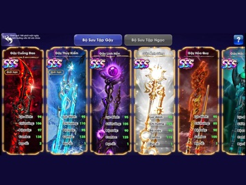
Bida 8 bi: Cơ Thủ Online đưa bạn vào những bàn đấu bida lỗ đầy kịch tính ngay trên điện thoại. Căn đường bi, điều chỉnh lực và độ xoáy, rồi so tài trực tuyến với những cơ thủ khác. BA CHẾ ĐỘ, MỖI TRẬN MỘT THỬ THÁCH • 8 BI: Đấu trí bằng những cú đánh chính xác, tính toán đường bi và làm chủ thế trận. • 9 BI: Đưa bi vào lỗ theo đúng thứ tự và tìm cơ hội kết thúc trận đấu bằng bi số 9. • ĐẠI GIA: Thử sức với nhịp đấu nhanh, kịch tính và nhiều tình huống bất ngờ. TẠO DẤU ẤN BẰNG BỘ GẬY RIÊNG Mở khóa nhiều mẫu gậy với thiết kế và chỉ số khác nhau. Lựa chọn cây gậy phù hợp với lối chơi, nâng cao khả năng kiểm soát và thể hiện phong cách của riêng bạn trên bàn đấu. CÙNG CLB VƯƠN LÊN Gia nhập CLB, trò chuyện với những người cùng đam mê và phối hợp với các thành viên để tranh tài tại đấu trường liên CLB mỗi tuần. LUÔN CÓ MỤC TIÊU MỚI Hoàn thành nhiệm vụ hằng ngày, tham gia các sự kiện định kỳ và…
App details
What you can learn from Bida 8 bi: Cơ thủ online
Every shipping app on the App Store has gone through the same decisions you're working through right now: which screenshot goes first, what caption sits over it, which device frame to show, what color the background should be. The 13 screenshots above are Bida 8 bi: Cơ thủ online's answers to those questions — they're public, they're real, and they made it through Apple's review.
What the numbers say: Bida 8 bi: Cơ thủ online runs a dark set with one background colour (#040C1C) carried across every screenshot — the listing reads as a single poster when the shots sit side by side in search results. The accent colour we picked up, #340474, is the one to reuse for badges, arrows and highlighted words if you borrow this look. Hit Use this style to open the editor with these exact colours and drop your own screenshot in.
Notice the first screenshot in particular. It's the one users see in search results and on the product page, and it's where most apps spend their best caption and tightest design. Look at the proportion of background to phone, where the text sits, what one thing the image is trying to communicate.
Want to see how other Games apps approach the same problem? Browse more Games apps in the showcase.
Take what works into your own screenshots
Open LaunchShots and design your App Store & Google Play screenshots — pick a device frame, drop captions, ship in minutes. Free, in your browser.
Open the screenshot editor →Apps with a similar look
Closest background + accent colours among the listings we've analysed — useful when you want to see the same palette handled by a different team.