Chart position — tracked daily by LaunchShots
Screenshot style breakdown
Sampled from 4 of FungGun ฟังกัน - นิยายเสียง's App Store screenshots — background, accent and theme, measured by LaunchShots (not something Apple publishes).
#141424 bg
#343442
#EC6C4C accent
#FFFFFF text
Reading the caption text from the screenshots in your browser…
Screenshots


Icon palette
About this app
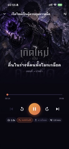
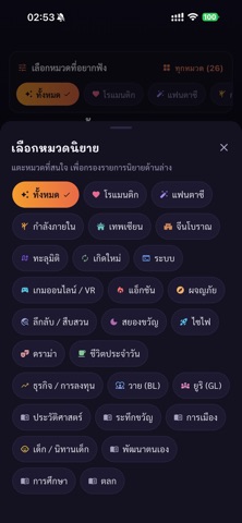
FungGun (ฟังกัน) — แอปฟังนิยายเสียงภาษาไทย ฟังได้ทันที ไม่ต้องสมัครสมาชิก ฟังนิยายเสียงหลากหลายแนวที่พากย์ครบทุกตอน อัปเดตเรื่องใหม่และตอนใหม่ทุกวัน เปิดแอปแล้วกดฟังได้เลย จะฟังระหว่างเดินทาง ทำงานบ้าน ออกกำลังกาย หรือก่อนนอนก็ได้ ■ ฟีเจอร์หลัก • ฟังทันที — เข้ามาก็ฟังได้เลย ไม่ต้องล็อกอิน • เล่นต่อเนื่องอัตโนมัติ — จบตอนแล้วไปตอนถัดไปให้เอง ไม่ต้องกดเอง • ฟังตอนหน้าจอดับ — เล่นเบื้องหลังพร้อมปุ่มควบคุมบนหน้าจอล็อก • ปรับความเร็วได้ 0.5x - 2.0x ตามใจ • ดาวน์โหลดไว้ฟังออฟไลน์ — ไม่มีเน็ตก็ฟังได้ ประหยัดค่าเน็ต • ฟังต่อจากที่ค้างไว้ — จำตำแหน่งให้ทุกเรื่อง ทุกเครื่อง • คลังส่วนตัว — เก็บเรื่องโปรดไว้ที่เดียว • ค้นหาและเลือกตามหมวด — โรแมนติก แฟนตาซี กำลังภายใน เทพเซียน ระบบ สืบสวน และอีกมาก ข้อกำหนดการใช้งาน: https://funggun.com/legal/terms นโยบายความเป็นส่วนตัว: https://funggun.com/legal/privacy ■ สำหรับนักเขียนและนักพากย์ เปิดรับครีเอเตอร์ลงผลงาน ติดต่อเรา: contact@agosee.com
App details
What you can learn from FungGun ฟังกัน - นิยายเสียง
Every shipping app on the App Store has gone through the same decisions you're working through right now: which screenshot goes first, what caption sits over it, which device frame to show, what color the background should be. The 4 screenshots above are FungGun ฟังกัน - นิยายเสียง's answers to those questions — they're public, they're real, and they made it through Apple's review.
What the numbers say: FungGun ฟังกัน - นิยายเสียง runs a dark set with one background colour (#141424) carried across every screenshot — the listing reads as a single poster when the shots sit side by side in search results. The accent colour we picked up, #EC6C4C, is the one to reuse for badges, arrows and highlighted words if you borrow this look. Hit Use this style to open the editor with these exact colours and drop your own screenshot in.
Notice the first screenshot in particular. It's the one users see in search results and on the product page, and it's where most apps spend their best caption and tightest design. Look at the proportion of background to phone, where the text sits, what one thing the image is trying to communicate.
Want to see how other Book apps approach the same problem? Browse more Book apps in the showcase.
Take what works into your own screenshots
Open LaunchShots and design your App Store & Google Play screenshots — pick a device frame, drop captions, ship in minutes. Free, in your browser.
Open the screenshot editor →Apps with a similar look
Closest background + accent colours among the listings we've analysed — useful when you want to see the same palette handled by a different team.