Chart position — tracked daily by LaunchShots
Screenshot style breakdown
Sampled from 5 of Strit's App Store screenshots — background, accent and theme, measured by LaunchShots (not something Apple publishes).
#F4F4EC bg
#D6D6CF
#34CC5C accent
#111111 text
Reading the caption text from the screenshots in your browser…
Screenshots

Icon palette
About this app
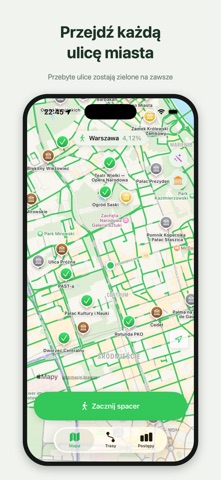
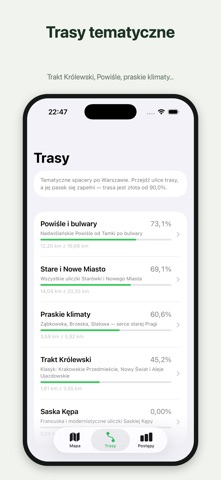
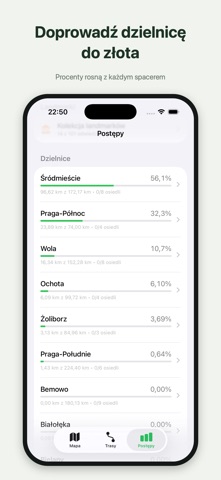
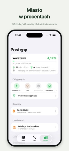
Ile ulic swojego miasta naprawdę widziałeś? Strit zamienia Warszawę w planszę gry: nagrywaj spacery, a przebyte ulice zaznaczą się na mapie na zawsze. Zbieraj ulice jak karty, wypełniaj osiedla procentami i doprowadź swoją dzielnicę do złota. • 5 311 ulic do zebrania — od Marszałkowskiej po uliczki, o których nie słyszałeś • 144 osiedla i 18 dzielnic z procentami postępu; złoto od 90% • Zaliczanie na żywo, w trakcie spaceru — bez czekania, bez konta, bez internetu • Planer tras: pętla na X km albo trasa do celu maksymalizująca nowe ulice • 123 warszawskie landmarki z opisami — od PKiN po podwórka i neony • Osiągnięcia od Brązu do Diamentu, serie dni, kamienie milowe miasta • Masz historię w innych apkach? Import plików GPX i TCX (Strava, Garmin Connect i inne) oraz treningów z Apple Health — Twoja mapa zapełni się w minutę • Ulicę przebytą przed Stritem oznaczysz ręcznie, a ni…
App details
What you can learn from Strit
Every shipping app on the App Store has gone through the same decisions you're working through right now: which screenshot goes first, what caption sits over it, which device frame to show, what color the background should be. The 5 screenshots above are Strit's answers to those questions — they're public, they're real, and they made it through Apple's review.
What the numbers say: Strit runs a light set with one background colour (#F4F4EC) carried across every screenshot — the listing reads as a single poster when the shots sit side by side in search results. The accent colour we picked up, #34CC5C, is the one to reuse for badges, arrows and highlighted words if you borrow this look. Hit Use this style to open the editor with these exact colours and drop your own screenshot in.
Notice the first screenshot in particular. It's the one users see in search results and on the product page, and it's where most apps spend their best caption and tightest design. Look at the proportion of background to phone, where the text sits, what one thing the image is trying to communicate.
Want to see how other Health & Fitness apps approach the same problem? Browse more Health & Fitness apps in the showcase.
Take what works into your own screenshots
Open LaunchShots and design your App Store & Google Play screenshots — pick a device frame, drop captions, ship in minutes. Free, in your browser.
Open the screenshot editor →Apps with a similar look
Closest background + accent colours among the listings we've analysed — useful when you want to see the same palette handled by a different team.