Chart position — tracked daily by LaunchShots
Screenshot style breakdown
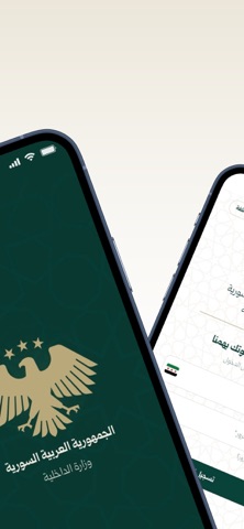
Sampled from 6 of صوتك وصل's App Store screenshots — background, accent and theme, measured by LaunchShots (not something Apple publishes).
#FCFCEC bg
#DDDDCF
#84744C accent
#111111 text
Screenshots



Icon palette
About this app
«صوتك وصل» هو التطبيق الرسمي لوزارة الداخلية في الجمهورية العربية السورية، ويمنح كل مواطن — داخل سوريا أو خارجها — قناة مباشرة وموثّقة لتقديم الطلبات إلى الجهات المختصة ومتابعتها حتى معالجتها، دون معاملات ورقية ودون مراجعة المكاتب. قدّم طلبك خلال دقائق اختر الخدمة التي تحتاجها، واملأ البيانات المطلوبة، وأرفق الملفات المؤيّدة. يقدّم التطبيق ثلاث خدمات، لكل منها نموذج مخصّص: • شكوى عامة — لتقديم شكوى بحق أحد العاملين في وزارة الداخلية أو على خدمة تقدّمها إحدى دوائرها. • إزالة منع سفر — لتقديم طلب رفع منع السفر المسجّل بحقك. • الاستعلام عن موقوف — لسؤال الجهة المختصة عن مكان موقوف ووضعه. للسوريين في الخارج يستطيع السوريون المقيمون خارج البلاد استخدام التطبيق من أي مكان في العالم، دون السفر إلى سوريا ودون وسيط. قدّم طلب إزالة منع سفر واستوضح وضعك قبل العودة إلى الوطن، أو استعلم عن قريب موقوف، أو اعرض أي أمر يخصّك — وتصلك إجابة الجهة المختصة مباشرة على هاتفك. والواجهة متوفّرة بالإنكليزية …
App details
What you can learn from صوتك وصل
Every shipping app on the App Store has gone through the same decisions you're working through right now: which screenshot goes first, what caption sits over it, which device frame to show, what color the background should be. The 6 screenshots above are صوتك وصل's answers to those questions — they're public, they're real, and they made it through Apple's review.
What the numbers say: صوتك وصل runs a mixed light-and-dark set where the background shifts from screenshot to screenshot (first shot #FCFCEC) — each image has to stand on its own, so the captions carry more of the story. The accent colour we picked up, #84744C, is the one to reuse for badges, arrows and highlighted words if you borrow this look. Hit Use this style to open the editor with these exact colours and drop your own screenshot in.
Notice the first screenshot in particular. It's the one users see in search results and on the product page, and it's where most apps spend their best caption and tightest design. Look at the proportion of background to phone, where the text sits, what one thing the image is trying to communicate.
Want to see how other Productivity apps approach the same problem? Browse more Productivity apps in the showcase.
Take what works into your own screenshots
Open LaunchShots and design your App Store & Google Play screenshots — pick a device frame, drop captions, ship in minutes. Free, in your browser.
Open the screenshot editor →Apps with a similar look
Closest background + accent colours among the listings we've analysed — useful when you want to see the same palette handled by a different team.