Chart position — tracked daily by LaunchShots
Screenshot style breakdown
Sampled from 6 of Il Figaro Club's App Store screenshots — background, accent and theme, measured by LaunchShots (not something Apple publishes).
#1C1414 bg
#3B3434
#6C442C accent
#FFFFFF text
Reading the caption text from the screenshots in your browser…
Screenshots






Icon palette
About this app
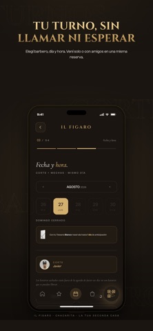
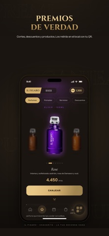
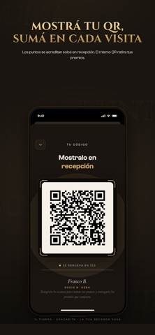
Il Figaro Club es la app de socios de Il Figaro, la barbería italiana de Chacarita. Tu tessera digital: sumás puntos con cada visita y cada compra, subís de nivel y canjeás premios reales que retirás en el local. TU TESSERA, TU NIVEL Sumá puntos cada vez que te cortás o comprás productos. Subí de nivel — Verde, Bianco, Rosso y Nero — y desbloqueá más beneficios con cada color. Tus puntos disponibles no vencen: lo que ganaste es tuyo hasta que lo canjeás. TU QR DE SOCIO Mostrá tu QR en recepción y los puntos se acreditan solos. El mismo QR sirve para retirar tus premios. TURNOS SIN LLAMAR Reservá con el barbero que quieras o con el primero disponible, y sacá turno con amigos en una misma reserva. Te avisamos antes del turno para que no se te pase. PREMIOS DE VERDAD Canjeá tus puntos por cortes, descuentos y productos, y retiralos en el local. El día de tu cumpleaños te espera un desc…
App details
What you can learn from Il Figaro Club
Every shipping app on the App Store has gone through the same decisions you're working through right now: which screenshot goes first, what caption sits over it, which device frame to show, what color the background should be. The 10 screenshots above are Il Figaro Club's answers to those questions — they're public, they're real, and they made it through Apple's review.
What the numbers say: Il Figaro Club runs a dark set with one background colour (#1C1414) carried across every screenshot — the listing reads as a single poster when the shots sit side by side in search results. The accent colour we picked up, #6C442C, is the one to reuse for badges, arrows and highlighted words if you borrow this look. Hit Use this style to open the editor with these exact colours and drop your own screenshot in.
Notice the first screenshot in particular. It's the one users see in search results and on the product page, and it's where most apps spend their best caption and tightest design. Look at the proportion of background to phone, where the text sits, what one thing the image is trying to communicate.
Want to see how other Lifestyle apps approach the same problem? Browse more Lifestyle apps in the showcase.
Take what works into your own screenshots
Open LaunchShots and design your App Store & Google Play screenshots — pick a device frame, drop captions, ship in minutes. Free, in your browser.
Open the screenshot editor →Apps with a similar look
Closest background + accent colours among the listings we've analysed — useful when you want to see the same palette handled by a different team.