Screenshot style breakdown
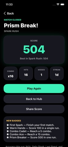
Sampled from 4 of Pickcolorfun's App Store screenshots — background, accent and theme, measured by LaunchShots (not something Apple publishes).
#040404 bg
#272727
#3CF4BC accent
#FFFFFF text
- #14 Spark Rush Match the color. The pulse gets faster. A Shape Hunt @ Dual Spark
- #2Shapes reshuffle every round. Trust the rule at the top, not your memory of the last tile.
- #3Share Score NEW BADGES * First Spark — Finish your first match.
Captions read from the screenshots (OCR, may contain small errors): 3 headlines, 15 words on average (longest 17), 67% speak to "you".
Screenshots



Icon palette
About this app
Pickcolorfun — Catch the Color. Trust the Form. A fast, joyful reflex studio for anyone who likes colors, shapes, and a shrinking pulse. A cue appears at the top. Below, random geometric glyphs flash in bold hues. Tap the match before the bar runs out. Why it feels different Every round rolls a new form — triangle, trapezoid, square, pentagon, or circle — so you never settle into a grid of squares. Speed, focus, and a little visual trickery, in short sessions. Game Modes Spark Rush — accelerating color hunt Shape Hunt — form only Dual Spark — color and form together Mind Twist — Stroop-style ink vs word Flow Mode — no timer Time Blitz — 60-second score attack Last Stand — three lives Daily Glyph — one fair 30-round seed for everyone, shareable score Made to come back Daily streak, five daily missions, twelve badges, per-mode records, eight neon themes, Shape Codex, Color Assist, hap…
App details
What you can learn from Pickcolorfun
Every shipping app on the App Store has gone through the same decisions you're working through right now: which screenshot goes first, what caption sits over it, which device frame to show, what color the background should be. The 4 screenshots above are Pickcolorfun's answers to those questions — they're public, they're real, and they made it through Apple's review.
What the numbers say: Pickcolorfun runs a dark set with one background colour (#040404) carried across every screenshot — the listing reads as a single poster when the shots sit side by side in search results. The accent colour we picked up, #3CF4BC, is the one to reuse for badges, arrows and highlighted words if you borrow this look. Hit Use this style to open the editor with these exact colours and drop your own screenshot in.
Notice the first screenshot in particular. It's the one users see in search results and on the product page, and it's where most apps spend their best caption and tightest design. Look at the proportion of background to phone, where the text sits, what one thing the image is trying to communicate.
Want to see how other Graphics & Design apps approach the same problem? Browse more Graphics & Design apps in the showcase.
Take what works into your own screenshots
Open LaunchShots and design your App Store & Google Play screenshots — pick a device frame, drop captions, ship in minutes. Free, in your browser.
Open the screenshot editor →Apps with a similar look
Closest background + accent colours among the listings we've analysed — useful when you want to see the same palette handled by a different team.