Chart position — tracked daily by LaunchShots
Screenshot style breakdown
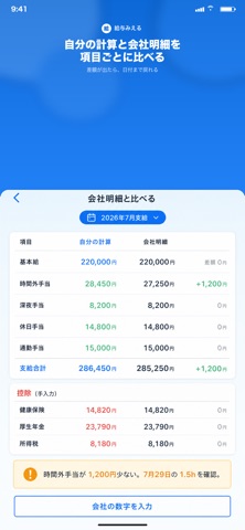
Sampled from 4 of 給与みえる's App Store screenshots — background, accent and theme, measured by LaunchShots (not something Apple publishes).
#FCFCFC bg
#DDDDDD
#1C7CF4 accent
#111111 text
Reading the caption text from the screenshots in your browser…
Screenshots



Icon palette
About this app
給与みえるは、出退勤と残業を自分で記録し、労働基準法の割増ルールで支給額を計算して、会社の給与明細と突き合わせるための、この端末だけの台帳です。 打刻アプリではありません。手取りのシミュレーターでもありません。「自分の計算」と「会社の明細」を、項目と日付で照合するためのアプリです。 【できること】 ・時間外、深夜、法定休日、所定休日、60時間超を分けて割増を計算する ・締め日に合わせた勤怠期間で月の支給を集計する(カレンダーの1日から月末ではありません) ・固定残業(みなし残業)は、込みの時間を超えた分だけ足す ・会社明細の金額を転記して、自分の計算との差額を見る ・日付を開けば、その差がどの出退勤・残業から来たかを追う ・早番、日勤、遅番、夜勤が混ざっても、給料は分けて集計する ・36協定の時間の進みと、都道府県の最低賃金を目安として見る 【向いている人】 ・月給の正社員、契約社員で、基本給と残業代が明細と合っているか確かめたい人 ・固定残業が付いている人で、超過分だけ足されているかを見たい人 ・…
App details
What you can learn from 給与みえる
Every shipping app on the App Store has gone through the same decisions you're working through right now: which screenshot goes first, what caption sits over it, which device frame to show, what color the background should be. The 4 screenshots above are 給与みえる's answers to those questions — they're public, they're real, and they made it through Apple's review.
What the numbers say: 給与みえる runs a light set with one background colour (#FCFCFC) carried across every screenshot — the listing reads as a single poster when the shots sit side by side in search results. The accent colour we picked up, #1C7CF4, is the one to reuse for badges, arrows and highlighted words if you borrow this look. Hit Use this style to open the editor with these exact colours and drop your own screenshot in.
Notice the first screenshot in particular. It's the one users see in search results and on the product page, and it's where most apps spend their best caption and tightest design. Look at the proportion of background to phone, where the text sits, what one thing the image is trying to communicate.
Want to see how other Utilities apps approach the same problem? Browse more Utilities apps in the showcase.
Take what works into your own screenshots
Open LaunchShots and design your App Store & Google Play screenshots — pick a device frame, drop captions, ship in minutes. Free, in your browser.
Open the screenshot editor →Apps with a similar look
Closest background + accent colours among the listings we've analysed — useful when you want to see the same palette handled by a different team.