Chart position — tracked daily by LaunchShots
Screenshot style breakdown
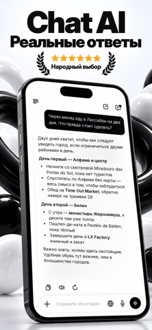
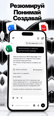
Sampled from 3 of Чат GPT — ГПТ's App Store screenshots — background, accent and theme, measured by LaunchShots (not something Apple publishes).
#FCFCFC bg
#DDDDDD
#ECA42C accent
#111111 text
Screenshots

Icon palette
About this app
"Знакомьтесь с Чат GPT — вашим повседневным ИИ-ассистентом для вопросов, идей и творчества. Естественное общение Общайтесь с мощным ИИ так же, как с осведомлённым другом. Задавайте вопросы, придумывайте идеи, получайте помощь с работой или учёбой или просто ведите беседу — всё в быстром и простом чат-интерфейсе. Голос и изображения Говорите естественно и ведите беседу в реальном времени на ходу с голосовым режимом. Опишите, что хотите увидеть, и наблюдайте, как это оживает, или сделайте либо загрузите фото, чтобы распознать текст или определить, что на нём изображено. Помощь на каждый день От домашних заданий и написания текстов до планирования и быстрых советов — Чат GPT создан для студентов, специалистов, писателей и всех, кто хочет иметь умного, способного ассистента в кармане — для учёбы, творчества или просто чтобы делать дела быстрее. Конфиденциальность Ваши сообщения, фото и …
App details
What you can learn from Чат GPT — ГПТ
Every shipping app on the App Store has gone through the same decisions you're working through right now: which screenshot goes first, what caption sits over it, which device frame to show, what color the background should be. The 3 screenshots above are Чат GPT — ГПТ's answers to those questions — they're public, they're real, and they made it through Apple's review.
What the numbers say: Чат GPT — ГПТ runs a light set with one background colour (#FCFCFC) carried across every screenshot — the listing reads as a single poster when the shots sit side by side in search results. The accent colour we picked up, #ECA42C, is the one to reuse for badges, arrows and highlighted words if you borrow this look. Hit Use this style to open the editor with these exact colours and drop your own screenshot in.
Notice the first screenshot in particular. It's the one users see in search results and on the product page, and it's where most apps spend their best caption and tightest design. Look at the proportion of background to phone, where the text sits, what one thing the image is trying to communicate.
Want to see how other Utilities apps approach the same problem? Browse more Utilities apps in the showcase.
Take what works into your own screenshots
Open LaunchShots and design your App Store & Google Play screenshots — pick a device frame, drop captions, ship in minutes. Free, in your browser.
Open the screenshot editor →Apps with a similar look
Closest background + accent colours among the listings we've analysed — useful when you want to see the same palette handled by a different team.