Chart position — tracked daily by LaunchShots
Screenshot style breakdown
Sampled from 4 of Zafer ZOne's App Store screenshots — background, accent and theme, measured by LaunchShots (not something Apple publishes).
#FCFCFC bg
#DDDDDD
#24548C accent
#111111 text
Reading the caption text from the screenshots in your browser…
Screenshots

Icon palette
About this app
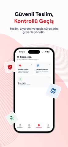
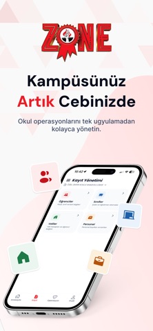
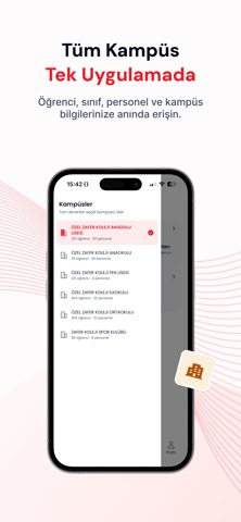
Zone (Z-PASS), Zafer Koleji'nin resmî giriş-çıkış ve güvenli teslim uygulamasıdır. Velisinden öğretmenine, güvenlik görevlisinden okul yönetimine kadar okulun tüm paydaşlarını tek bir güvenlik zinciri üzerinde buluşturur. Amaç basit: her öğrenci, her gün, yalnızca yetkili kişiye teslim edilsin. VELİLER İÇİN • Yaklaştım: Okula vardığınızda tek dokunuşla haber verin; çocuğunuz siz kapıya gelmeden hazırlanır. Araçtan inmeden, kalabalıkta beklemeden teslim alın. • Z-QR: Size özel dijital kimliğinizle turnike ve kapı geçişlerinizi temassız yapın. • Teslim yetkisi: Çocuğunuzu sizin yerinize kimin teslim alabileceğini uygulamadan yönetin; yetkisiz hiç kimse öğrencinizi okuldan çıkaramaz. • Cüzdan ve yemekhane: Bakiyenizi, harcama hareketlerini ve yemek menüsünü anlık takip edin. ÖĞRETMENLER İÇİN • Teslim çağrıları: Veli okula yaklaştığında çağrı anında ekranınıza düşer; öğrenciyi kapıya za…
App details
What you can learn from Zafer ZOne
Every shipping app on the App Store has gone through the same decisions you're working through right now: which screenshot goes first, what caption sits over it, which device frame to show, what color the background should be. The 4 screenshots above are Zafer ZOne's answers to those questions — they're public, they're real, and they made it through Apple's review.
What the numbers say: Zafer ZOne runs a light set with one background colour (#FCFCFC) carried across every screenshot — the listing reads as a single poster when the shots sit side by side in search results. The accent colour we picked up, #24548C, is the one to reuse for badges, arrows and highlighted words if you borrow this look. Hit Use this style to open the editor with these exact colours and drop your own screenshot in.
Notice the first screenshot in particular. It's the one users see in search results and on the product page, and it's where most apps spend their best caption and tightest design. Look at the proportion of background to phone, where the text sits, what one thing the image is trying to communicate.
Want to see how other Productivity apps approach the same problem? Browse more Productivity apps in the showcase.
Take what works into your own screenshots
Open LaunchShots and design your App Store & Google Play screenshots — pick a device frame, drop captions, ship in minutes. Free, in your browser.
Open the screenshot editor →Apps with a similar look
Closest background + accent colours among the listings we've analysed — useful when you want to see the same palette handled by a different team.