Chart position — tracked daily by LaunchShots
Screenshot style breakdown
Sampled from 6 of تقويم أم البنين (ع)'s App Store screenshots — background, accent and theme, measured by LaunchShots (not something Apple publishes).
#FCFCFC bg
#DDDDDD
#04345C accent
#111111 text
Reading the caption text from the screenshots in your browser…
Screenshots


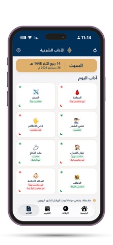
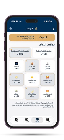


iPad screenshots


Icon palette
About this app
تطبيق "تقويم أم البنين (ع)" هو دليلك الشامل والموثوق لمعرفة الأوقات الشرعية، المناسبات الدينية، والآداب والأعمال اليومية المختصرة. صُمم التطبيق بعناية فائقة ليكون رفيقك اليومي على الآيفون والآيباد وساعة أبل، من خلال واجهة تفاعلية حديثة، أنيقة، ومريحة للعين وخالية تماماً من الإعلانات حفاظاً على روحانية المستخدم. أبرز مميزات التطبيق: مواقيت شرعية فلكية دقيقة: • حساب دقيق لأوقات الصلوات اليومية (الإمساك، الفجر، الشروق، الظهرين، الغروب، العشائين، ومنتصف الليل الشرعي). • مؤشر الصلاة القادمة مع عداد تنازلي حي يبين الوقت المتبقي لدخول وقت الصلاة. ودجات تفاعلية للشاشة الرئيسية وشاشة القفل (Widgets): • مجموعة غنية من الودجات بمختلف الأحجام (صغير، متوسط، عريض). • ودجات شاشة القفل (Lock Screen Widgets) لعرض الصلاة القادمة والوقت المتبقي بلمحة سريعة. • ودجت تقويم يعرض التاريخ الهجري والميلادي ومناسبة اليوم وآدابه. دعم كامل لساعة أبل (Apple Watch): • تطبيق مخصص للساعة بتصميم داكن فاخر يناسب …
App details
What you can learn from تقويم أم البنين (ع)
Every shipping app on the App Store has gone through the same decisions you're working through right now: which screenshot goes first, what caption sits over it, which device frame to show, what color the background should be. The 11 screenshots above are تقويم أم البنين (ع)'s answers to those questions — they're public, they're real, and they made it through Apple's review.
What the numbers say: تقويم أم البنين (ع) runs a light set with one background colour (#FCFCFC) carried across every screenshot — the listing reads as a single poster when the shots sit side by side in search results. The accent colour we picked up, #04345C, is the one to reuse for badges, arrows and highlighted words if you borrow this look. Hit Use this style to open the editor with these exact colours and drop your own screenshot in.
Notice the first screenshot in particular. It's the one users see in search results and on the product page, and it's where most apps spend their best caption and tightest design. Look at the proportion of background to phone, where the text sits, what one thing the image is trying to communicate.
Want to see how other Reference apps approach the same problem? Browse more Reference apps in the showcase.
Take what works into your own screenshots
Open LaunchShots and design your App Store & Google Play screenshots — pick a device frame, drop captions, ship in minutes. Free, in your browser.
Open the screenshot editor →Apps with a similar look
Closest background + accent colours among the listings we've analysed — useful when you want to see the same palette handled by a different team.