Chart position — tracked daily by LaunchShots
Screenshot style breakdown
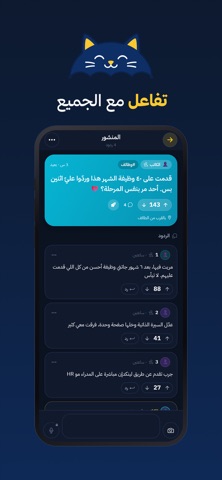
Sampled from 4 of مطر Matr's App Store screenshots — background, accent and theme, measured by LaunchShots (not something Apple publishes).
#0C1C34 bg
#2E3B50
#6444EC accent
#FFFFFF text
Reading the caption text from the screenshots in your browser…
Screenshots



Icon palette
About this app
مطر تطبيق مجتمع محلي بدون أسماء. تفتحه فتشوف وش يكتب اللي حولك في مدينتك: خبر، سؤال، توصية، تجربة، أو شي صار قبل شوي في حيّك. وتكتب أنت بدون ما يعرف أحد من أنت. • بدون حساب ولا رقم جوال ما نطلب تسجيل ولا بريد ولا رقم جوال. افتح التطبيق وابدأ. • مدينتك أولاً الأجواء تعرض منشورات مدينتك، ومع كل منشور تشوف كم يبعد عنك. • صوّت وارفع ارفع المنشور اللي يستاهل، والمجتمع هو اللي يقرر وش يوصل للأعلى. • محادثات خاصة عجبك منشور؟ أرسل لصاحبه طلب تواصل. إذا قبل تنفتح محادثة خاصة بينكم، وتبقون بلا أسماء. • مجتمعات قنوات لكل اهتمام: أسئلة، وظائف، مطاعم، رياضة، وغيرها. • صور وتصويت وصوت صوّر ولوّن واكتب على صورتك، اسأل المجتمع بتصويت، أو أرسل رسالة صوتية. مجتمع آمن: تقدر تبلّغ عن أي منشور أو رد أو رسالة، وتحظر أي حساب بضغطة واحدة فيختفي محتواه عنك كاملاً. نراجع البلاغات خلال 24 ساعة ونحذف المخالف ونوقف حسابه، ونصفّي الألفاظ المسيئة تلقائياً. مطر بلس (اختياري): اشتراك يفتح 35 طلب تواصل يومياً، و…
App details
What you can learn from مطر Matr
Every shipping app on the App Store has gone through the same decisions you're working through right now: which screenshot goes first, what caption sits over it, which device frame to show, what color the background should be. The 4 screenshots above are مطر Matr's answers to those questions — they're public, they're real, and they made it through Apple's review.
What the numbers say: مطر Matr runs a dark set with one background colour (#0C1C34) carried across every screenshot — the listing reads as a single poster when the shots sit side by side in search results. The accent colour we picked up, #6444EC, is the one to reuse for badges, arrows and highlighted words if you borrow this look. Hit Use this style to open the editor with these exact colours and drop your own screenshot in.
Notice the first screenshot in particular. It's the one users see in search results and on the product page, and it's where most apps spend their best caption and tightest design. Look at the proportion of background to phone, where the text sits, what one thing the image is trying to communicate.
Want to see how other Social Networking apps approach the same problem? Browse more Social Networking apps in the showcase.
Take what works into your own screenshots
Open LaunchShots and design your App Store & Google Play screenshots — pick a device frame, drop captions, ship in minutes. Free, in your browser.
Open the screenshot editor →Apps with a similar look
Closest background + accent colours among the listings we've analysed — useful when you want to see the same palette handled by a different team.