Chart position — tracked daily by LaunchShots
Screenshot style breakdown
Sampled from 5 of Библия виджет: стих дня's App Store screenshots — background, accent and theme, measured by LaunchShots (not something Apple publishes).
#FCF4EC bg
#DDD6CF
#64440C accent
#111111 text
Screenshots



Icon palette
About this app
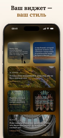
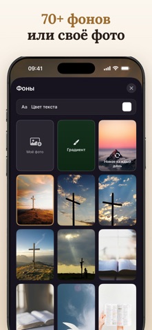
Стих из Библии на экране блокировки и домашнем экране — подобранный под то, что вы переживаете сегодня. Новый каждое утро, без открытия приложения и без интернета. 29 СОСТОЯНИЙ, ДЛЯ КАЖДОГО СВОЯ ПОДБОРКА Бог, Благодать, Вера, Хвала, Доверие, Мудрость, Твоя ценность, Исцеление, Ясный ум, Доброта, Покой, Отпустить гнев, Без тревоги, Смелость, Новые силы, Ты не один, Утешение, Чистое сердце, Простить других, Устоять, Защита, Радость, Любовь, Благодарность, Надежда, Уверенность, Новое начало, Утро, Спокойной ночи. Выберите состояние — и виджет будет показывать стихи именно об этом. Ищете стихи при тревоге, страхе, горе, одиночестве, чувстве вины, гневе, для благодарности или об исцелении? У каждого из этих состояний своя подборка. КОГДА ЭТО НУЖНО • Не спится от мыслей • Ждёте результат анализов • Болеет близкий человек • Потеряли кого-то, и дома стало тихо • Начинаете новое, и страшно •…
App details
What you can learn from Библия виджет: стих дня
Every shipping app on the App Store has gone through the same decisions you're working through right now: which screenshot goes first, what caption sits over it, which device frame to show, what color the background should be. The 5 screenshots above are Библия виджет: стих дня's answers to those questions — they're public, they're real, and they made it through Apple's review.
What the numbers say: Библия виджет: стих дня runs a light set with one background colour (#FCF4EC) carried across every screenshot — the listing reads as a single poster when the shots sit side by side in search results. The accent colour we picked up, #64440C, is the one to reuse for badges, arrows and highlighted words if you borrow this look. Hit Use this style to open the editor with these exact colours and drop your own screenshot in.
Notice the first screenshot in particular. It's the one users see in search results and on the product page, and it's where most apps spend their best caption and tightest design. Look at the proportion of background to phone, where the text sits, what one thing the image is trying to communicate.
Want to see how other Reference apps approach the same problem? Browse more Reference apps in the showcase.
Take what works into your own screenshots
Open LaunchShots and design your App Store & Google Play screenshots — pick a device frame, drop captions, ship in minutes. Free, in your browser.
Open the screenshot editor →Apps with a similar look
Closest background + accent colours among the listings we've analysed — useful when you want to see the same palette handled by a different team.