Chart position — tracked daily by LaunchShots
Screenshot style breakdown
Sampled from 6 of LockDay: Список дел и планер's App Store screenshots — background, accent and theme, measured by LaunchShots (not something Apple publishes).
#FCFCFC bg
#DDDDDD
#DCB484 accent
#111111 text
Reading the caption text from the screenshots in your browser…
Screenshots
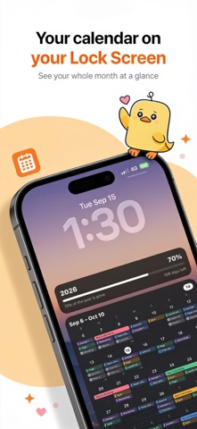
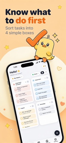


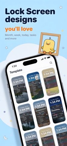

Icon palette
About this app
Весь ваш день на экране блокировки. LockDay превращает задачи, календарь и заметки в экран блокировки, который обновляется сам. Берёте iPhone — и уже знаете, что дальше. — СНАЧАЛА ГЛАВНОЕ Сортируйте задачи по важности и срочности в простой матрице из четырёх квадратов. Важное всегда перед глазами. — КАЛЕНДАРЬ + ЗАДАЧИ События из календарей iPhone рядом с задачами: полоса недели, месячный вид и лента на сегодня. — ЭКРАН БЛОКИРОВКИ, КОТОРЫЙ ОБНОВЛЯЕТСЯ САМ Выберите шаблон, решите, что показывать, и добавьте своё фото. Быстрая разовая настройка в «Командах» поддерживает его актуальным. — ЗАМЕТКИ И ВИДЖЕТЫ Закрепите заметку или чеклист на экране блокировки. Виджеты для экрана «Домой» и экрана блокировки. — КОНФИДЕНЦИАЛЬНОСТЬ Без аккаунта, без рекламы, без отслеживания. Ваши данные остаются на устройстве или в вашем iCloud. LockDay Pro открывает все шаблоны и стили, неограниченные зад…
App details
What you can learn from LockDay: Список дел и планер
Every shipping app on the App Store has gone through the same decisions you're working through right now: which screenshot goes first, what caption sits over it, which device frame to show, what color the background should be. The 6 screenshots above are LockDay: Список дел и планер's answers to those questions — they're public, they're real, and they made it through Apple's review.
What the numbers say: LockDay: Список дел и планер runs a light set where the background shifts from screenshot to screenshot (first shot #FCFCFC) — each image has to stand on its own, so the captions carry more of the story. The accent colour we picked up, #DCB484, is the one to reuse for badges, arrows and highlighted words if you borrow this look. Hit Use this style to open the editor with these exact colours and drop your own screenshot in.
Notice the first screenshot in particular. It's the one users see in search results and on the product page, and it's where most apps spend their best caption and tightest design. Look at the proportion of background to phone, where the text sits, what one thing the image is trying to communicate.
Want to see how other Productivity apps approach the same problem? Browse more Productivity apps in the showcase.
Take what works into your own screenshots
Open LaunchShots and design your App Store & Google Play screenshots — pick a device frame, drop captions, ship in minutes. Free, in your browser.
Open the screenshot editor →Apps with a similar look
Closest background + accent colours among the listings we've analysed — useful when you want to see the same palette handled by a different team.