Chart position — tracked daily by LaunchShots
Screenshot style breakdown
Sampled from 5 of Infinite You Coaching's App Store screenshots — background, accent and theme, measured by LaunchShots (not something Apple publishes).
#F4ECDC bg
#D6CFC1
#5C1C24 accent
#111111 text
Screenshots


Icon palette
About this app
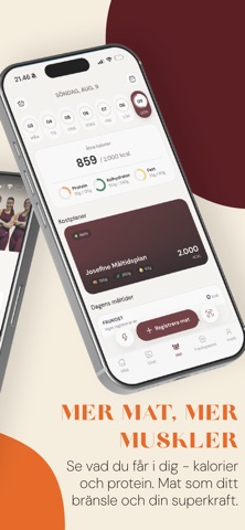
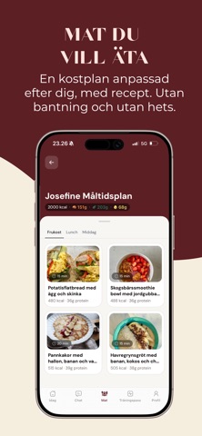
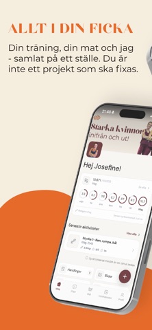
Det finns gott om träningsappar som utgår från att du är 25, sover åtta timmar och har hela veckan fri för träning. Den här är byggd för ett annat liv. Öppnar du den på morgonen ligger dagens schema framme: passen, måltiderna och de vanor du fokuserar på just nu. Du loggar din vikt och följer kurvan över några veckor, i stället för att fastna vid en enskild morgon. Och när klockan är kvart över fem, du precis har kommit hem och kylskåpet inte ser särskilt inspirerande ut, bläddrar du i receptboken tills du hittar något du faktiskt är sugen på och lägger ingredienserna i inköpslistan. För oss är hälsa mer än siffran på vågen och tiden på milen. Sover du dåligt, ligger vaken klockan tre eller känner att kroppen inte beter sig som den brukade, då hör det lika mycket hemma i planen som träningen gör. Många av kvinnorna vi jobbar med är mitt i klimakteriet, när sömnen och orken kan förändr…
App details
What you can learn from Infinite You Coaching
Every shipping app on the App Store has gone through the same decisions you're working through right now: which screenshot goes first, what caption sits over it, which device frame to show, what color the background should be. The 5 screenshots above are Infinite You Coaching's answers to those questions — they're public, they're real, and they made it through Apple's review.
What the numbers say: Infinite You Coaching runs a mixed light-and-dark set where the background shifts from screenshot to screenshot (first shot #F4ECDC) — each image has to stand on its own, so the captions carry more of the story. The accent colour we picked up, #5C1C24, is the one to reuse for badges, arrows and highlighted words if you borrow this look. Hit Use this style to open the editor with these exact colours and drop your own screenshot in.
Notice the first screenshot in particular. It's the one users see in search results and on the product page, and it's where most apps spend their best caption and tightest design. Look at the proportion of background to phone, where the text sits, what one thing the image is trying to communicate.
Want to see how other Health & Fitness apps approach the same problem? Browse more Health & Fitness apps in the showcase.
Take what works into your own screenshots
Open LaunchShots and design your App Store & Google Play screenshots — pick a device frame, drop captions, ship in minutes. Free, in your browser.
Open the screenshot editor →Apps with a similar look
Closest background + accent colours among the listings we've analysed — useful when you want to see the same palette handled by a different team.