Chart position — tracked daily by LaunchShots
Screenshot style breakdown
Sampled from 6 of Plitsch's App Store screenshots — background, accent and theme, measured by LaunchShots (not something Apple publishes).
#FC9C1C bg
#DD8918
#6C4C1C accent
#111111 text
Reading the caption text from the screenshots in your browser…
Screenshots



Icon palette
About this app
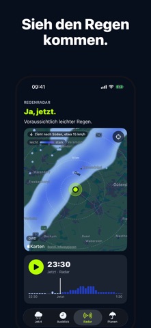
Regnet’s gleich? Plitsch sagt es dir für die nächste Stunde auf die Minute: ob es regnet, wann es losgeht, wie stark und wie lange. Das ist kostenlos, genauso wie deine Orte und die Widgets auf dem Home-Bildschirm. Radar, Ausblick, Planen und die Uhr gibt es mit dem Abo. JETZT Oben steht die Antwort, groß: „Ja.“, „Nein.“ oder „Kaum.“, wenn höchstens ein paar Tropfen fallen. Darunter steht, wann, etwa „In etwa 25 Minuten.“, und der Regenverlauf der Stunde. Sobald es regnet, wird der Bildschirm blau. Schneit es statt zu regnen, fragt Plitsch: Schneit es? WENN PLITSCH ETWAS NICHT WEISS Ist die Vorhersage zu alt oder fehlen Daten, siehst du das. Wie oft Plitsch in Deutschland richtig lag, steht in den Einstellungen. AUSBLICK (ABO) Die nächsten 24 Stunden mit Regen, Temperatur, Nacht und Wind, auf Wunsch in Knoten oder Beaufort, unter „Woche“ sieben Tage. In Deutschland mit den amtlichen …
App details
What you can learn from Plitsch
Every shipping app on the App Store has gone through the same decisions you're working through right now: which screenshot goes first, what caption sits over it, which device frame to show, what color the background should be. The 9 screenshots above are Plitsch's answers to those questions — they're public, they're real, and they made it through Apple's review.
What the numbers say: Plitsch runs a mixed light-and-dark set where the background shifts from screenshot to screenshot (first shot #FC9C1C) — each image has to stand on its own, so the captions carry more of the story. The accent colour we picked up, #6C4C1C, is the one to reuse for badges, arrows and highlighted words if you borrow this look. Hit Use this style to open the editor with these exact colours and drop your own screenshot in.
Notice the first screenshot in particular. It's the one users see in search results and on the product page, and it's where most apps spend their best caption and tightest design. Look at the proportion of background to phone, where the text sits, what one thing the image is trying to communicate.
Want to see how other Weather apps approach the same problem? Browse more Weather apps in the showcase.
Take what works into your own screenshots
Open LaunchShots and design your App Store & Google Play screenshots — pick a device frame, drop captions, ship in minutes. Free, in your browser.
Open the screenshot editor →Apps with a similar look
Closest background + accent colours among the listings we've analysed — useful when you want to see the same palette handled by a different team.