Chart position — tracked daily by LaunchShots
Screenshot style breakdown
Sampled from 6 of ورد البقرة's App Store screenshots — background, accent and theme, measured by LaunchShots (not something Apple publishes).
#FCF4EC bg
#DDD6CF
#D4B43C accent
#111111 text
Screenshots


iPad screenshots
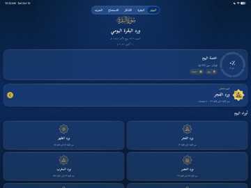


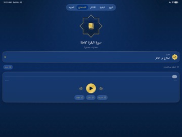

Icon palette
About this app
ورد البقرة هو تطبيق قرآني يساعدك على المحافظة على قراءة سورة البقرة يوميًا، من خلال تقسيمها إلى خمسة أوراد موزعة على أوقات اليوم، في تجربة قراءة مريحة تجمع بين جمال التصميم وسهولة الاستخدام. سورة البقرة كاملة اقرأ سورة البقرة بآياتها الـ286، مع عرض النص القرآني بالتشكيل، وإمكانية متابعة القراءة من آخر موضع وصلت إليه. خمسة أوراد يومية قُسمت سورة البقرة إلى خمسة أوراد لتيسير قراءتها خلال اليوم: • ورد الفجر • ورد الظهر • ورد العصر • ورد المغرب • ورد العشاء متابعة الإنجاز اليومي تابع تقدمك في قراءة السورة، وتعرف على الأوراد التي أكملتها، واحتفظ بسجل ختماتك اليومية. الاستماع إلى سورة البقرة استمع إلى تلاوات سورة البقرة بأصوات مجموعة من القراء، مع أدوات للتحكم بالتشغيل وإمكانية تنزيل التلاوات المتاحة للاستماع دون اتصال بالإنترنت. تفسير الآيات اطلع على تفسير آيات سورة البقرة لفهم معانيها، من خلال واجهة مرتبطة بالنص القرآني. أذكار الصباح والمساء اقرأ الأذكار اليومية وتابع عدد مرات تكرارها باستخ…
App details
What you can learn from ورد البقرة
Every shipping app on the App Store has gone through the same decisions you're working through right now: which screenshot goes first, what caption sits over it, which device frame to show, what color the background should be. The 15 screenshots above are ورد البقرة's answers to those questions — they're public, they're real, and they made it through Apple's review.
What the numbers say: ورد البقرة runs a mixed light-and-dark set where the background shifts from screenshot to screenshot (first shot #FCF4EC) — each image has to stand on its own, so the captions carry more of the story. The accent colour we picked up, #D4B43C, is the one to reuse for badges, arrows and highlighted words if you borrow this look. Hit Use this style to open the editor with these exact colours and drop your own screenshot in.
Notice the first screenshot in particular. It's the one users see in search results and on the product page, and it's where most apps spend their best caption and tightest design. Look at the proportion of background to phone, where the text sits, what one thing the image is trying to communicate.
Want to see how other Reference apps approach the same problem? Browse more Reference apps in the showcase.
Take what works into your own screenshots
Open LaunchShots and design your App Store & Google Play screenshots — pick a device frame, drop captions, ship in minutes. Free, in your browser.
Open the screenshot editor →Apps with a similar look
Closest background + accent colours among the listings we've analysed — useful when you want to see the same palette handled by a different team.