Chart position — tracked daily by LaunchShots
Screenshot style breakdown
Sampled from 6 of Графический Дизайн: Design Lab's App Store screenshots — background, accent and theme, measured by LaunchShots (not something Apple publishes).
#FCFCFC bg
#DDDDDD
#CC54FC accent
#111111 text
Screenshots

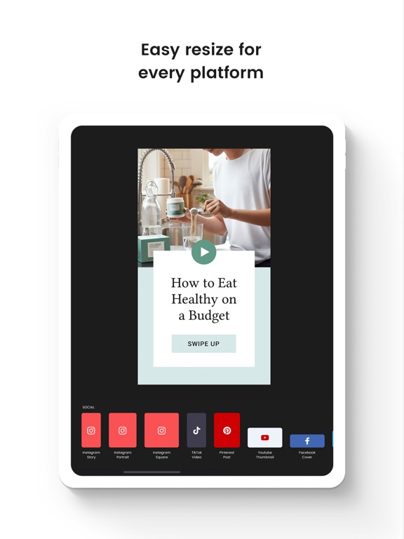
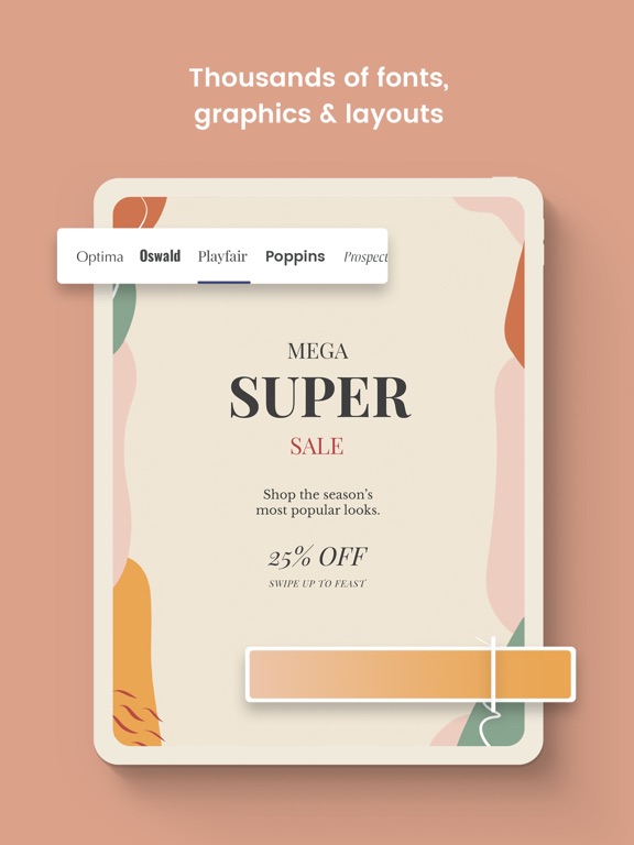
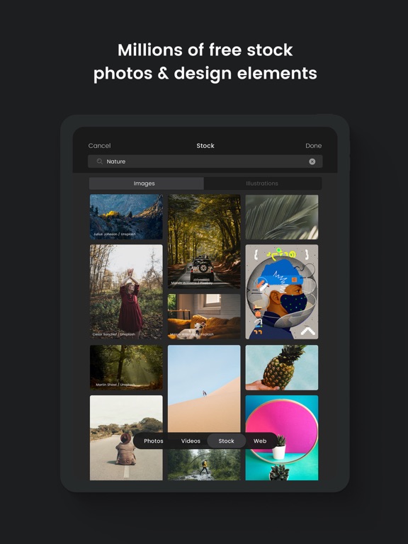
iPad screenshots
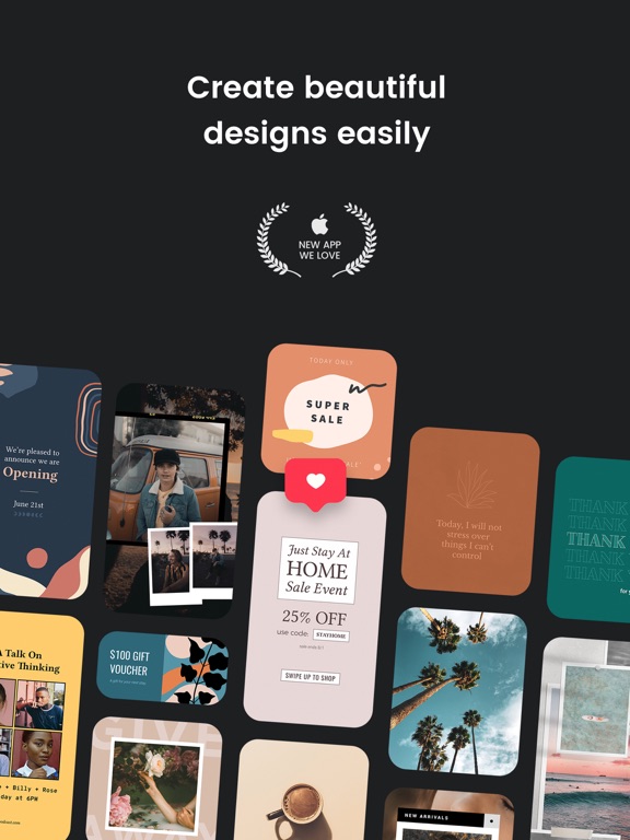
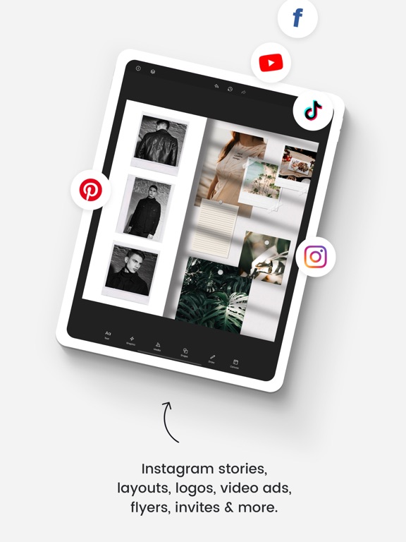
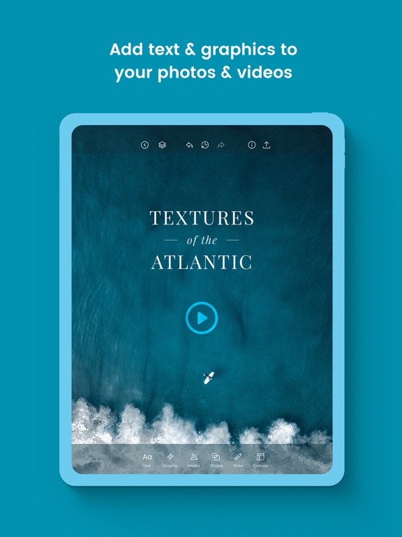
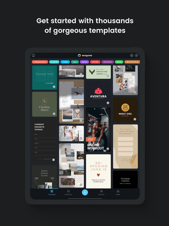

Icon palette
About this app
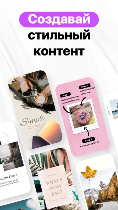
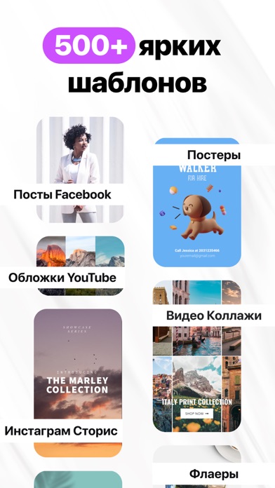
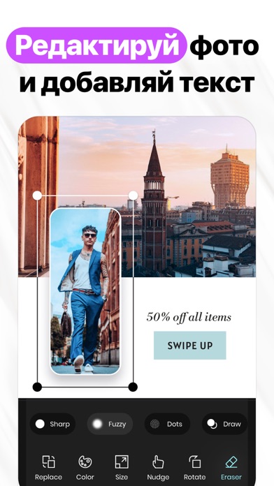
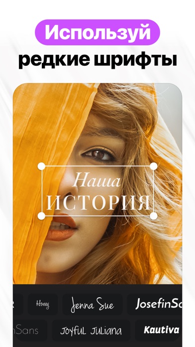
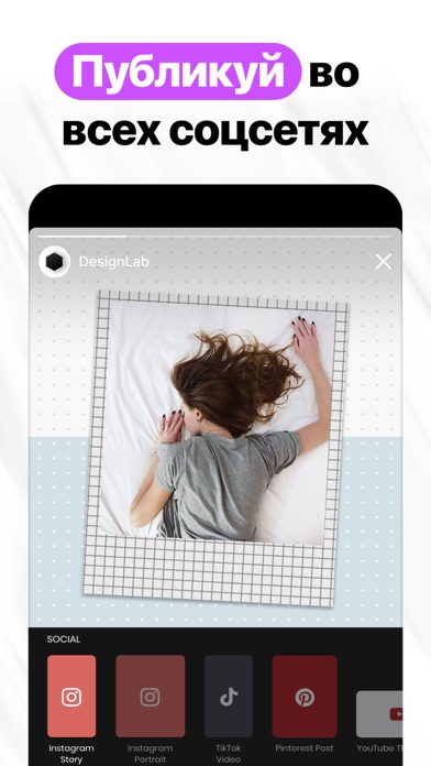
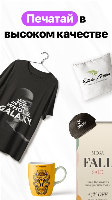
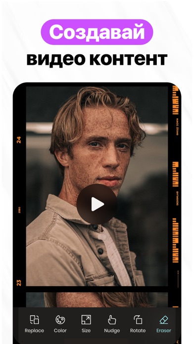
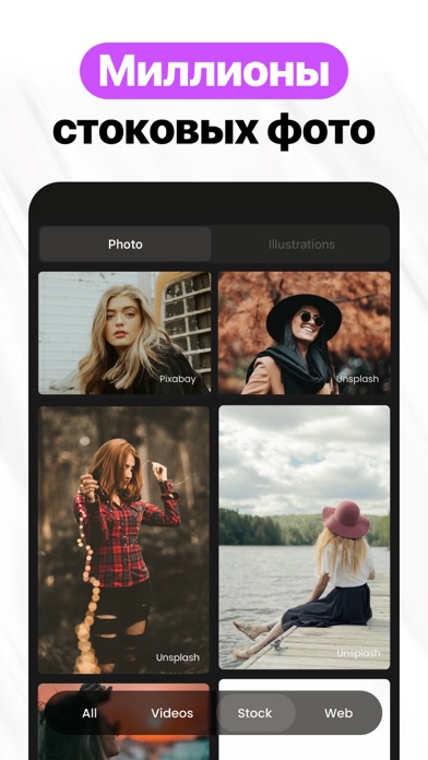
Создавай проф. дизайны и графику с DesignLab. Выбирай из миллионов изображений, шрифтов и шаблонов для воплощения ярких визуальных эффектов, идеально подходящих для соцсетей. ФУНКЦИИ: • НАСТРАИВАЕМЫЕ ШАБЛОНЫ Находи и редактируй под себя профессионально оформленные шаблоны из нашей библиотеки. • ФОТО ФИЛЬТРЫ И РЕДАКТИРОВАНИЕ Выбери фильтр из нашей коллекции, чтобы добиться желаемого эффекта. С точностью настраивай яркость, контрастность, экспозицию, насыщенность и уровень размытости ваших фотографий. • РАСШИРЕННЫЕ ТЕКСТОВЫЕ ИНСТРУМЕНТЫ Легко добавляй несколько слоев текста, меняя их размер, позиционирование, прозрачность, угол, стиль и цвет. Ты также можешь сгибать, стирать и применять 3D-эффекты к своему тексту! • ЗАХВАТЫВАЮЩИЙ АРТ DesignLab предлагает сотни прекрасных изображений, декоративных орнаментов и элементов дизайна. • БЕСПЛАТНЫЕ КОЛЛЕКЦИИ ФОТО Воспользуйся поиском в подб…
App details
What you can learn from Графический Дизайн: Design Lab
Every shipping app on the App Store has gone through the same decisions you're working through right now: which screenshot goes first, what caption sits over it, which device frame to show, what color the background should be. The 17 screenshots above are Графический Дизайн: Design Lab's answers to those questions — they're public, they're real, and they made it through Apple's review.
What the numbers say: Графический Дизайн: Design Lab runs a light set with one background colour (#FCFCFC) carried across every screenshot — the listing reads as a single poster when the shots sit side by side in search results. The accent colour we picked up, #CC54FC, is the one to reuse for badges, arrows and highlighted words if you borrow this look. Hit Use this style to open the editor with these exact colours and drop your own screenshot in.
Notice the first screenshot in particular. It's the one users see in search results and on the product page, and it's where most apps spend their best caption and tightest design. Look at the proportion of background to phone, where the text sits, what one thing the image is trying to communicate.
Want to see how other Graphics & Design apps approach the same problem? Browse more Graphics & Design apps in the showcase.
Take what works into your own screenshots
Open LaunchShots and design your App Store & Google Play screenshots — pick a device frame, drop captions, ship in minutes. Free, in your browser.
Open the screenshot editor →Apps with a similar look
Closest background + accent colours among the listings we've analysed — useful when you want to see the same palette handled by a different team.