Chart position — tracked daily by LaunchShots
Screenshot style breakdown
Sampled from 4 of 百度阅读-电子书看书阅读神器's App Store screenshots — background, accent and theme, measured by LaunchShots (not something Apple publishes).
#FCFCFC bg
#DDDDDD
#94CCFC accent
#111111 text
Screenshots
iPad screenshots
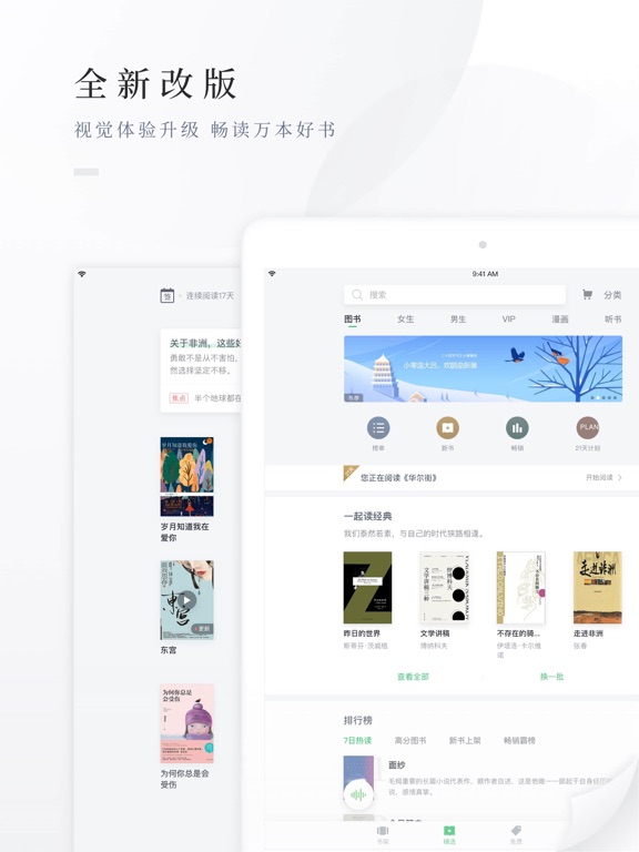
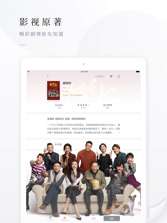
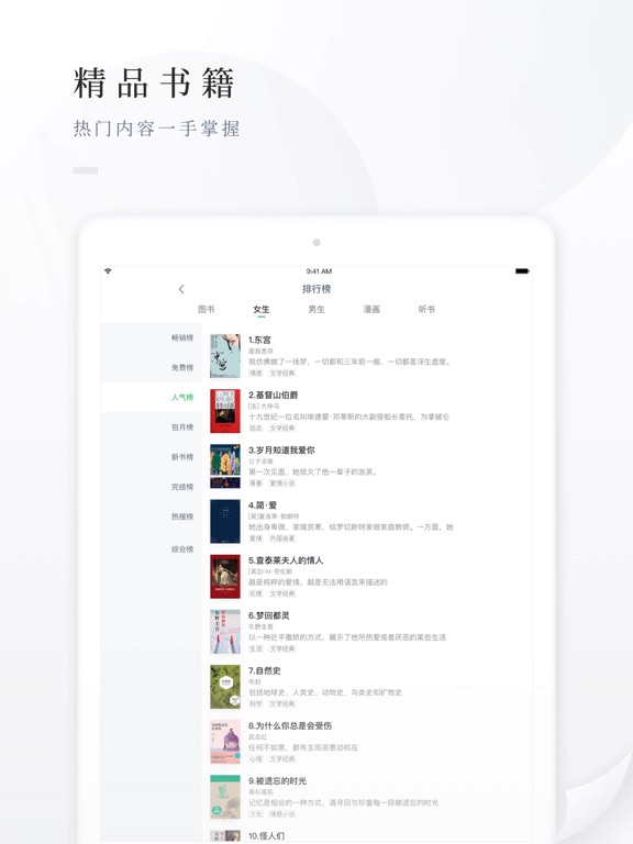
Icon palette
About this app
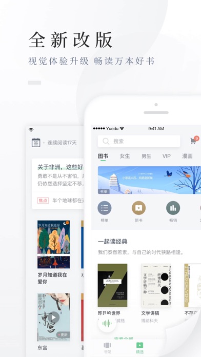
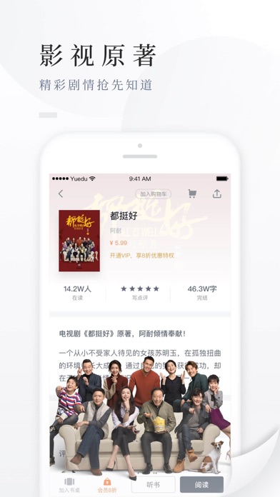
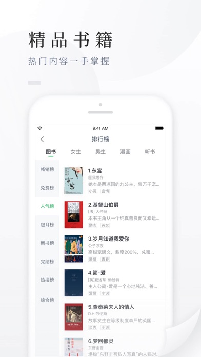
百度阅读——让时间更有价值 【百度阅读内容简介】 1、热门影视原著,随时限免: 扶摇皇后、为了你我愿意热爱整个世界、 法医秦明、温暖的弦、后宫如懿传、东宫、白鹿原、双峰、三国机密、地球上最后的夜晚等 2、经典畅销,好书不断: 三体、刺杀骑士团长、明朝那些事儿、万历十五年、冰与火之歌、人类简史、活着、鬼吹灯之黄皮子坟、耶路撒冷三千年等 3、唯美言情,时光有你: 爱如繁星、凉生我们可不可以不忧伤、初晨,是我故意忘记你、我站在桥上看风景、你好旧时光、曾少年、大约是爱等 4、经济励志,名人传记: 原则、精进如何成为一个很厉害的人、好好说话、商业的本质、自控术、周鸿祎:我的互联网思维、21世纪资本论等 扎克伯格传、李嘉诚全传、毛泽东传、蒋介石与现代中国等 5、二次元漫,畅听好书: 狐妖小红娘、纯情花嫁、扶摇皇后、脱身、古董局中局、莽荒纪、三生三世十里桃花、boss哥哥你欠揍、国民老公带回家、中国怪谈、斗破苍穹等,玩转二次元! 6、畅听好书: 扶摇皇后、脱身、古董局中局、莽荒纪、三生三世十里桃花、斗罗大陆、斗破苍穹、大泼猴…
App details
What you can learn from 百度阅读-电子书看书阅读神器
Every shipping app on the App Store has gone through the same decisions you're working through right now: which screenshot goes first, what caption sits over it, which device frame to show, what color the background should be. The 7 screenshots above are 百度阅读-电子书看书阅读神器's answers to those questions — they're public, they're real, and they made it through Apple's review.
What the numbers say: 百度阅读-电子书看书阅读神器 runs a light set with one background colour (#FCFCFC) carried across every screenshot — the listing reads as a single poster when the shots sit side by side in search results. The accent colour we picked up, #94CCFC, is the one to reuse for badges, arrows and highlighted words if you borrow this look. Hit Use this style to open the editor with these exact colours and drop your own screenshot in.
Notice the first screenshot in particular. It's the one users see in search results and on the product page, and it's where most apps spend their best caption and tightest design. Look at the proportion of background to phone, where the text sits, what one thing the image is trying to communicate.
Want to see how other Book apps approach the same problem? Browse more Book apps in the showcase.
Take what works into your own screenshots
Open LaunchShots and design your App Store & Google Play screenshots — pick a device frame, drop captions, ship in minutes. Free, in your browser.
Open the screenshot editor →Apps with a similar look
Closest background + accent colours among the listings we've analysed — useful when you want to see the same palette handled by a different team.