Chart position — tracked daily by LaunchShots
Screenshot style breakdown
Sampled from 5 of 割绳子2's App Store screenshots — background, accent and theme, measured by LaunchShots (not something Apple publishes).
#3CE4FC bg
#34C8DD
#9CCC04 accent
#111111 text
Screenshots
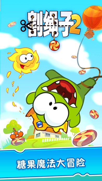
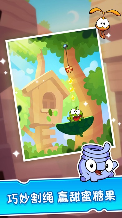


iPad screenshots


Icon palette
About this app
苹果精品力荐! 全球亿万小伙伴都在玩,萌到Cry的经典休闲小游戏! ●美味的糖果大冒险,只需手指轻轻一滑,帮小吃货圆满糖果梦! ●数百个小关卡玩到尽兴,找寻绳命的乐趣。放肆割!割!割! ●搞怪小伙伴倾情加盟,非凡的绝技助你一臂之力! ●高难度任务激发智力极限,超猛的道具轻松攻克难关! 哪里有美味糖果,哪里就有小吃货奥姆(Om Nom)的身影。不甘寂寞的它,在路上结识了六位新伙伴,为大家带来一场美食的大冒险。只需手指轻轻滑动割断绳子,让糖果穿过幸运星星送到小吃货嘴里,即为成功!在这趟旅途中,各式各样的奇妙经历等你去探险哦~ 【游戏特色】 ●爆萌画风:卡通画风清新可爱,小吃货甜蜜互动萌到不要不要的! ●丰富关卡:猛闯糖果森林、探秘沙漠大坝,数百关卡等你来! ●皇家套装:变忍者&当皇帝,造型变装趴体随心cos! ●神奇道具: 爱心糖果雨&解谜萤火虫,从天而降的糖果一次吃到饱! ●大咖伙伴:身怀绝技的萌萌哒小伙伴,甜蜜旅程中为你排除万难! ●每日奖励:每天登陆尽享装备奖励哦,超给力!领到手软! 更多精彩游戏,敬请关注游道易! …
App details
What you can learn from 割绳子2
Every shipping app on the App Store has gone through the same decisions you're working through right now: which screenshot goes first, what caption sits over it, which device frame to show, what color the background should be. The 10 screenshots above are 割绳子2's answers to those questions — they're public, they're real, and they made it through Apple's review.
What the numbers say: 割绳子2 runs a mixed light-and-dark set where the background shifts from screenshot to screenshot (first shot #3CE4FC) — each image has to stand on its own, so the captions carry more of the story. The accent colour we picked up, #9CCC04, is the one to reuse for badges, arrows and highlighted words if you borrow this look. Hit Use this style to open the editor with these exact colours and drop your own screenshot in.
Notice the first screenshot in particular. It's the one users see in search results and on the product page, and it's where most apps spend their best caption and tightest design. Look at the proportion of background to phone, where the text sits, what one thing the image is trying to communicate.
Want to see how other Games apps approach the same problem? Browse more Games apps in the showcase.
Take what works into your own screenshots
Open LaunchShots and design your App Store & Google Play screenshots — pick a device frame, drop captions, ship in minutes. Free, in your browser.
Open the screenshot editor →Apps with a similar look
Closest background + accent colours among the listings we've analysed — useful when you want to see the same palette handled by a different team.