Screenshot style breakdown
Sampled from 5 of 台风's App Store screenshots — background, accent and theme, measured by LaunchShots (not something Apple publishes).
#446C9C bg
#5E80A9
#348CF4 accent
#FFFFFF text
Screenshots


iPad screenshots


Icon palette
About this app
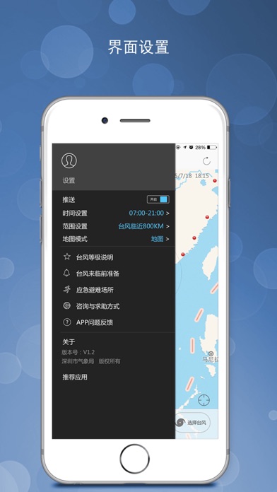
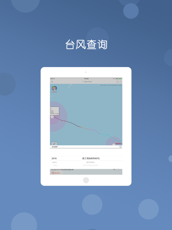
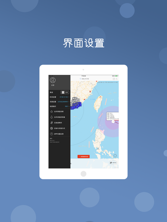
台风是深圳市气象局开发的专业台风服务软件,台风去哪了?你可以提前知道台风信息,你也可以通过我们的软件了解到最新的台风动态信息,及时做好防御,安排出行。 1、提供最新、最及时、最专业的台风路径和强度预报,台风去哪了,及时掌握。 2、提供预警信号、防御指引查询,停课停工,及时通知。 3、专业海洋预报信息,提供密集沿海气象探测信息,为你的航行提供指引。 4、提供深圳实时的本地风况信息、小时降雨等专业探测服务。 5、专业的台风提醒服务,让你不会错过任何一个影响你的台风信息。 6、丰富历史台风信息查询,作为台风爱好者怎能错过?
App details
What you can learn from 台风
Every shipping app on the App Store has gone through the same decisions you're working through right now: which screenshot goes first, what caption sits over it, which device frame to show, what color the background should be. The 10 screenshots above are 台风's answers to those questions — they're public, they're real, and they made it through Apple's review.
What the numbers say: 台风 runs a mixed light-and-dark set where the background shifts from screenshot to screenshot (first shot #446C9C) — each image has to stand on its own, so the captions carry more of the story. The accent colour we picked up, #348CF4, is the one to reuse for badges, arrows and highlighted words if you borrow this look. Hit Use this style to open the editor with these exact colours and drop your own screenshot in.
Notice the first screenshot in particular. It's the one users see in search results and on the product page, and it's where most apps spend their best caption and tightest design. Look at the proportion of background to phone, where the text sits, what one thing the image is trying to communicate.
Want to see how other Weather apps approach the same problem? Browse more Weather apps in the showcase.
Take what works into your own screenshots
Open LaunchShots and design your App Store & Google Play screenshots — pick a device frame, drop captions, ship in minutes. Free, in your browser.
Open the screenshot editor →Apps with a similar look
Closest background + accent colours among the listings we've analysed — useful when you want to see the same palette handled by a different team.