Screenshot style breakdown
Sampled from 3 of J-WAVEアプリ's App Store screenshots — background, accent and theme, measured by LaunchShots (not something Apple publishes).
#040404 bg
#272727
#2CACE4 accent
#FFFFFF text
Screenshots
Icon palette
About this app
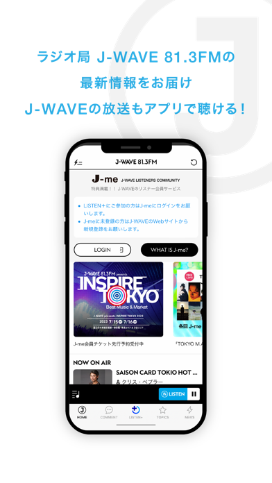
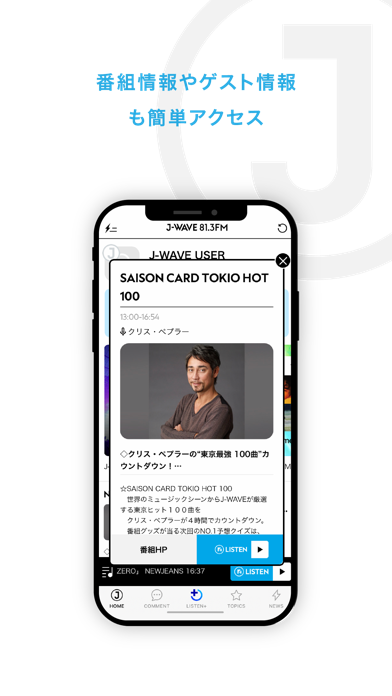
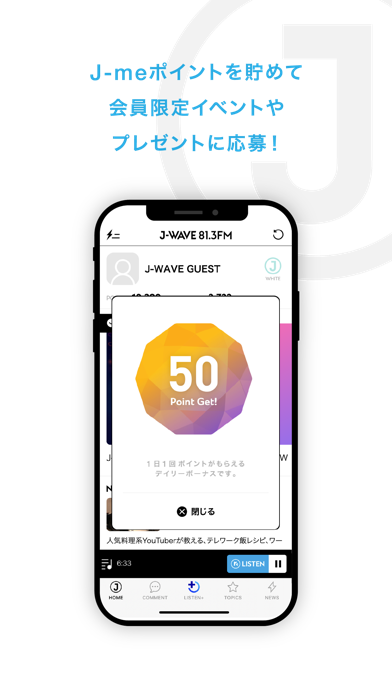
◎東京のラジオ局J-WAVE 81.3FMのアプリ◎ J-WAVEの聴取エリア、東京、神奈川、千葉、埼玉、茨城、栃木、群馬の1都6県に在住の方は、J-WAVEのライブ配信を聴取いただけます。 J-WAVE LISTENERS COMMUNITY”J-me”会員の方は、アプリにログインすることで、毎日ポイントの獲得が行えます。 獲得したポイントを利用して、会員限定のイベントやプレゼントに応募いただけます。 ※J-meはJ-WAVE WEBサイトにて、事前登録が必要となります。 さらに、月に50時間以上J-WAVEを聴くとデジタルステッカー(NFT) 他があたるキャンペーン「J-WAVE LISTEN+」にご参加いただけます。 【J-WAVEアプリの特徴】 ◆インターネット経由でJ-WAVEが聴ける! -別途radikoアプリをインストールする必要はございません。 ◆アプリ起動でボーナスポイントGet! -毎日1回アプリを立ち上げて画面をタッチするだけでポイントが貯まっていきます。 ◆会員限定のオトクなコンテンツ! -最新のJ-me会員限定イベントやチケット先行予約、プレゼント情報、オトクなクーポンを配信します。 ◆…
App details
What you can learn from J-WAVEアプリ
Every shipping app on the App Store has gone through the same decisions you're working through right now: which screenshot goes first, what caption sits over it, which device frame to show, what color the background should be. The 3 screenshots above are J-WAVEアプリ's answers to those questions — they're public, they're real, and they made it through Apple's review.
What the numbers say: J-WAVEアプリ runs a dark set with one background colour (#040404) carried across every screenshot — the listing reads as a single poster when the shots sit side by side in search results. The accent colour we picked up, #2CACE4, is the one to reuse for badges, arrows and highlighted words if you borrow this look. Hit Use this style to open the editor with these exact colours and drop your own screenshot in.
Notice the first screenshot in particular. It's the one users see in search results and on the product page, and it's where most apps spend their best caption and tightest design. Look at the proportion of background to phone, where the text sits, what one thing the image is trying to communicate.
Want to see how other Music apps approach the same problem? Browse more Music apps in the showcase.
Take what works into your own screenshots
Open LaunchShots and design your App Store & Google Play screenshots — pick a device frame, drop captions, ship in minutes. Free, in your browser.
Open the screenshot editor →Apps with a similar look
Closest background + accent colours among the listings we've analysed — useful when you want to see the same palette handled by a different team.