Screenshot changes — detected by LaunchShots
Screenshot style breakdown
Sampled from 6 of 今日は何の日?'s App Store screenshots — background, accent and theme, measured by LaunchShots (not something Apple publishes).
#6CBCF4 bg
#5FA5D6
#248CCC accent
#111111 text
Screenshots


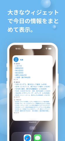


iPad screenshots


Icon palette
About this app
今日は何の日? 今日の記念日、歴史上の出来事、今日が誕生日の有名人が、開いた瞬間にわかります。朝礼や会議のひと言、商談の雑談、SNSの投稿ネタに。大安・仏滅などの六曜もその場で確認できます。 累計10万ダウンロード。 ■ 開いて3秒、今日の話のネタが見つかる 起動するとすぐ、今日の「記念日」「出来事」「誕生日の有名人」が一覧で表示されます。検索も入力も必要ありません。 ・朝礼や会議の冒頭のひと言に ・商談や初対面のアイスブレイクに ・SNS、ブログ、動画の投稿ネタに ・毎日のちょっとした雑学として ■ 六曜もひと目でわかる 大安・友引・先勝・先負・赤口・仏滅を、カレンダーを開かずに確認できます。結婚式や納車、お祝いごとの日取りを決めるときに。 ■ 1年365日、どの日でも調べられる 矢印で日付を前後に送るか、カレンダーから日付をタップするだけ。 「自分の誕生日と同じ有名人は誰?」「あの日は何があった日?」がその場で解決します。 ■ ウィジェットなら、アプリを開かなくていい ホーム画面とロック画面に今日の記念日を表示。…
App details
What you can learn from 今日は何の日?
Every shipping app on the App Store has gone through the same decisions you're working through right now: which screenshot goes first, what caption sits over it, which device frame to show, what color the background should be. The 12 screenshots above are 今日は何の日?'s answers to those questions — they're public, they're real, and they made it through Apple's review.
What the numbers say: 今日は何の日? runs a light set with one background colour (#6CBCF4) carried across every screenshot — the listing reads as a single poster when the shots sit side by side in search results. The accent colour we picked up, #248CCC, is the one to reuse for badges, arrows and highlighted words if you borrow this look. Hit Use this style to open the editor with these exact colours and drop your own screenshot in.
Notice the first screenshot in particular. It's the one users see in search results and on the product page, and it's where most apps spend their best caption and tightest design. Look at the proportion of background to phone, where the text sits, what one thing the image is trying to communicate.
Want to see how other Reference apps approach the same problem? Browse more Reference apps in the showcase.
Take what works into your own screenshots
Open LaunchShots and design your App Store & Google Play screenshots — pick a device frame, drop captions, ship in minutes. Free, in your browser.
Open the screenshot editor →Apps with a similar look
Closest background + accent colours among the listings we've analysed — useful when you want to see the same palette handled by a different team.