Chart position — tracked daily by LaunchShots
Screenshot style breakdown
Sampled from 6 of Zola - Wedding Planner's App Store screenshots — background, accent and theme, measured by LaunchShots (not something Apple publishes).
#0C0C0C bg
#2E2E2E
#9CF4FC accent
#FFFFFF text
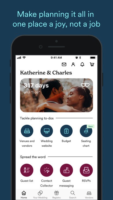
- #3Make planning it all in one place a joy, not a job
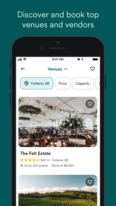
- #4Discover and book top venues and vendors
- #5One-click wonder: build your instant registry in 60 seconds
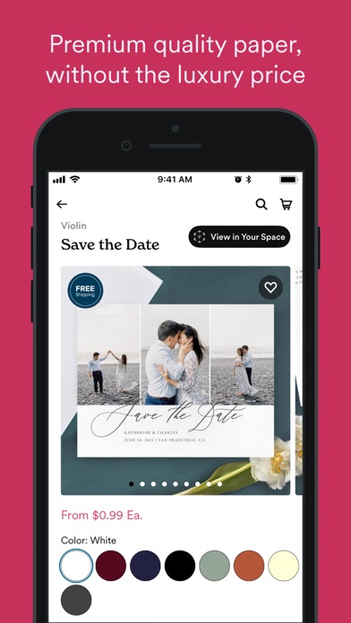
- #6Premium quality paper, without the luxury price
Captions read from the screenshots (OCR, may contain small errors): 4 headlines, 8.8 words on average (longest 12).
Screenshots



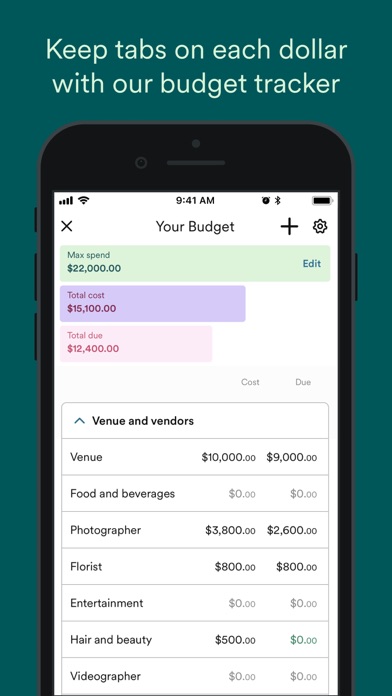
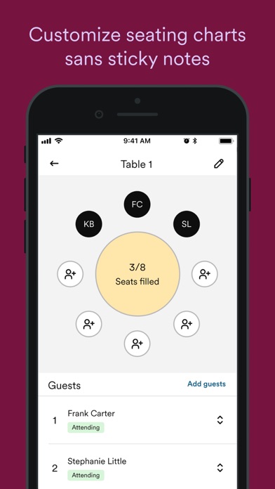

iPad screenshots


Icon palette
About this app
Ready to plan your wedding? Do it all with Zola. Zola’s free tools make wedding planning a joy, not a job. • Venues & vendors: Finding your dream team shouldn’t feel like a scavenger hunt. Get personalized vendor recs that fit your style, location, and budget. • Wedding website: Your love wasn’t built in 5 minutes, but your website can be! Our customizable templates make it easy to create a tailor-made, totally you site with no design skills required. • Invites + paper: The simplest way to get from “save the date” to “thanks so much!” Use our templates to create stunningly unique save the dates, wedding invitations, and more, plus get free samples and free addressing, too. • Registry: It’s the wedding registry, reinvented. Choose from thousands of gifts, experiences, and zero-fee cash funds you actually want, with hassle-free returns and exchanges. Or discover Instant Registry and …
App details
What you can learn from Zola - Wedding Planner
Every shipping app on the App Store has gone through the same decisions you're working through right now: which screenshot goes first, what caption sits over it, which device frame to show, what color the background should be. The 18 screenshots above are Zola - Wedding Planner's answers to those questions — they're public, they're real, and they made it through Apple's review.
What the numbers say: Zola - Wedding Planner runs a dark set where the background shifts from screenshot to screenshot (first shot #0C0C0C) — each image has to stand on its own, so the captions carry more of the story. The accent colour we picked up, #9CF4FC, is the one to reuse for badges, arrows and highlighted words if you borrow this look. Hit Use this style to open the editor with these exact colours and drop your own screenshot in.
Notice the first screenshot in particular. It's the one users see in search results and on the product page, and it's where most apps spend their best caption and tightest design. Look at the proportion of background to phone, where the text sits, what one thing the image is trying to communicate.
Want to see how other Lifestyle apps approach the same problem? Browse more Lifestyle apps in the showcase.
Take what works into your own screenshots
Open LaunchShots and design your App Store & Google Play screenshots — pick a device frame, drop captions, ship in minutes. Free, in your browser.
Open the screenshot editor →Apps with a similar look
Closest background + accent colours among the listings we've analysed — useful when you want to see the same palette handled by a different team.