Chart position — tracked daily by LaunchShots
Screenshot style breakdown
Sampled from 5 of myQuran — Коран на русском's App Store screenshots — background, accent and theme, measured by LaunchShots (not something Apple publishes).
#7CBCD4 bg
#6DA5BA
#D4B434 accent
#111111 text
Screenshots


iPad screenshots


Icon palette
About this app
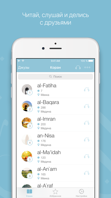
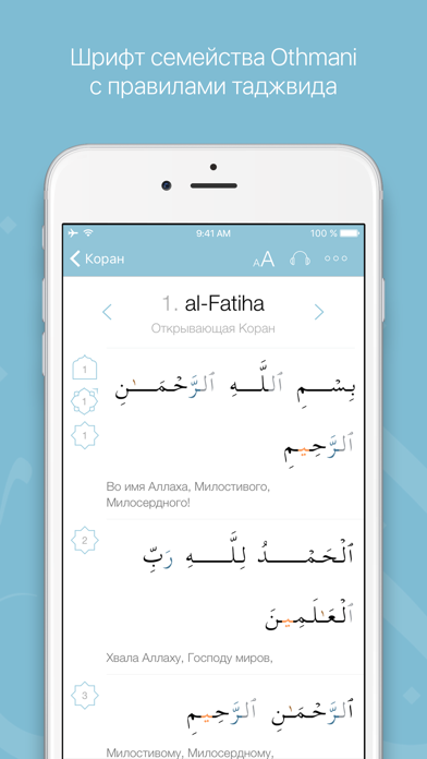
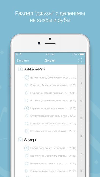
Приложение myQuran - ваш универсальный помощник, который позволит получать ещё больше пользы от чтения и прослушивания Корана. myQuran всегда будет у вас под рукой, где бы вы ни находились. Функциональные возможности: — Смысловой перевод на 25 языках; — Толкование (тафсир) Корана Абд ар-Рахмана бин Насира ас-Саади; — Оригинальный текст Корана с правилами таджвида; — Подробная информация о каждой суре; — Раздел с джузами; — Удобный и функциональный аудиоплеер; — Отдельное воспроизведение аятов (доступно для 11 чтецов); — Интерактивный поиск по сурам и аятам; — Добавление аятов в избранное; — Закладка; — Настройки шрифта; — Панель быстрого доступа к основным настройкам на странице суры; — Управление загруженными аудиофайлами; — Уведомления с полезными напоминаниями; — Поддержка технологии 3D Touch; Также, вы можете делиться аятами по электронной почте, сообщением, а также в социальны…
App details
What you can learn from myQuran — Коран на русском
Every shipping app on the App Store has gone through the same decisions you're working through right now: which screenshot goes first, what caption sits over it, which device frame to show, what color the background should be. The 8 screenshots above are myQuran — Коран на русском's answers to those questions — they're public, they're real, and they made it through Apple's review.
What the numbers say: myQuran — Коран на русском runs a light set with one background colour (#7CBCD4) carried across every screenshot — the listing reads as a single poster when the shots sit side by side in search results. The accent colour we picked up, #D4B434, is the one to reuse for badges, arrows and highlighted words if you borrow this look. Hit Use this style to open the editor with these exact colours and drop your own screenshot in.
Notice the first screenshot in particular. It's the one users see in search results and on the product page, and it's where most apps spend their best caption and tightest design. Look at the proportion of background to phone, where the text sits, what one thing the image is trying to communicate.
Want to see how other Reference apps approach the same problem? Browse more Reference apps in the showcase.
Take what works into your own screenshots
Open LaunchShots and design your App Store & Google Play screenshots — pick a device frame, drop captions, ship in minutes. Free, in your browser.
Open the screenshot editor →Apps with a similar look
Closest background + accent colours among the listings we've analysed — useful when you want to see the same palette handled by a different team.