Chart position — tracked daily by LaunchShots
Screenshot changes — detected by LaunchShots
Screenshot style breakdown
Sampled from 6 of Счетчик калорий: Худеем вместе's App Store screenshots — background, accent and theme, measured by LaunchShots (not something Apple publishes).
#ECE4F4 bg
#CFC8D6
#8C6CFC accent
#111111 text
Screenshots
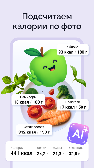
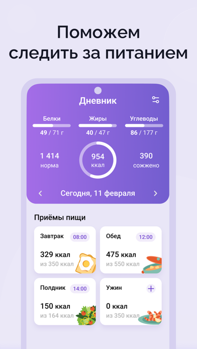
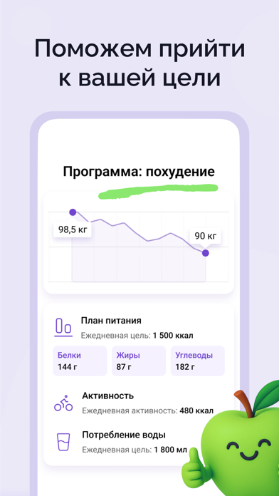
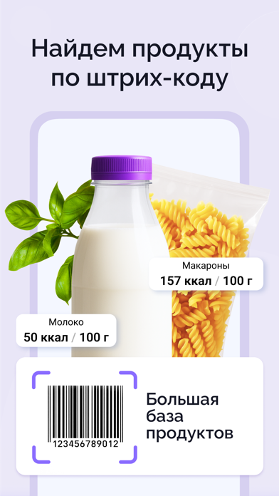
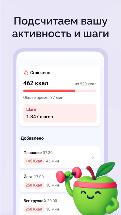
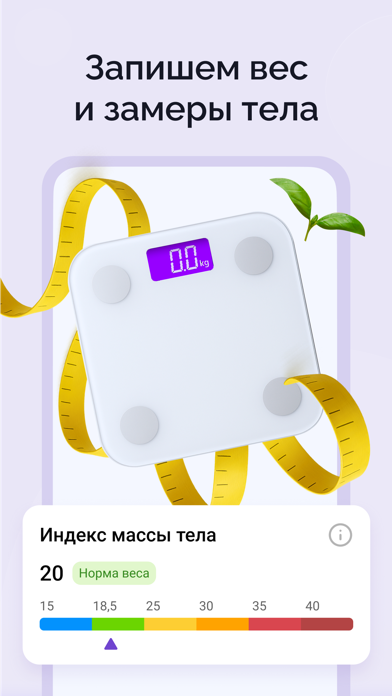
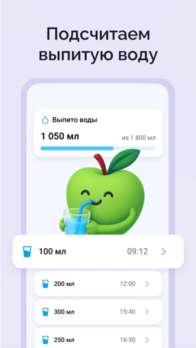

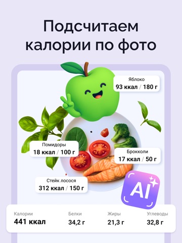
iPad screenshots


Icon palette
About this app
Хотите похудеть без лишних хлопот? Забудьте про неудобные таблицы и калькуляторы калорий, которые только запутывают, тратят ваше время и нервы. С бесплатным приложением "Худеем вместе" без рекламы вы сможете легко отслеживать процесс похудения, считать калории и КБЖУ и сохранять мотивацию – худеть на дефиците калорий, а не на голодании. Счетчик калорий и пищевой дневник превращают контроль веса и питания в простой и быстрый процесс, позволяя быстро адаптироваться к диете и следить за своим прогрессом в одном месте. Что делает "Худеем вместе" удобным помощником для похудения? Подсчёт калорий и БЖУ Добавляйте продукты/блюда, и приложение рассчитает их калорийность в ккал, а также белки, жиры и углеводы. Вся информация сохраняется в удобном дневнике питания, чтобы вы могли легко отслеживать рацион. Калории по фото с помощью ИИ-камеры Сфотографируйте блюдо, и умная камера AI определит …
App details
What you can learn from Счетчик калорий: Худеем вместе
Every shipping app on the App Store has gone through the same decisions you're working through right now: which screenshot goes first, what caption sits over it, which device frame to show, what color the background should be. The 11 screenshots above are Счетчик калорий: Худеем вместе's answers to those questions — they're public, they're real, and they made it through Apple's review.
What the numbers say: Счетчик калорий: Худеем вместе runs a light set with one background colour (#ECE4F4) carried across every screenshot — the listing reads as a single poster when the shots sit side by side in search results. The accent colour we picked up, #8C6CFC, is the one to reuse for badges, arrows and highlighted words if you borrow this look. Hit Use this style to open the editor with these exact colours and drop your own screenshot in.
Notice the first screenshot in particular. It's the one users see in search results and on the product page, and it's where most apps spend their best caption and tightest design. Look at the proportion of background to phone, where the text sits, what one thing the image is trying to communicate.
Want to see how other Health & Fitness apps approach the same problem? Browse more Health & Fitness apps in the showcase.
Take what works into your own screenshots
Open LaunchShots and design your App Store & Google Play screenshots — pick a device frame, drop captions, ship in minutes. Free, in your browser.
Open the screenshot editor →Apps with a similar look
Closest background + accent colours among the listings we've analysed — useful when you want to see the same palette handled by a different team.