Screenshot style breakdown
Sampled from 5 of 奥克斯A+'s App Store screenshots — background, accent and theme, measured by LaunchShots (not something Apple publishes).
#FCFCFC bg
#DDDDDD
#6C8CB4 accent
#111111 text
Screenshots

Icon palette
About this app
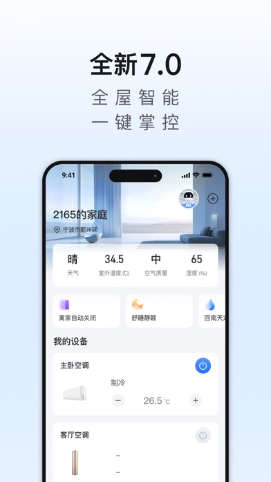
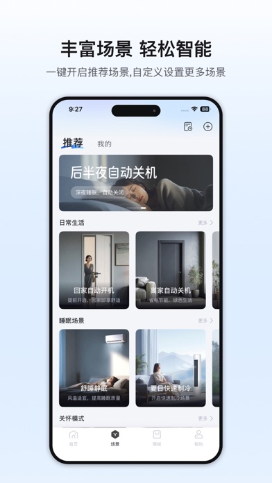
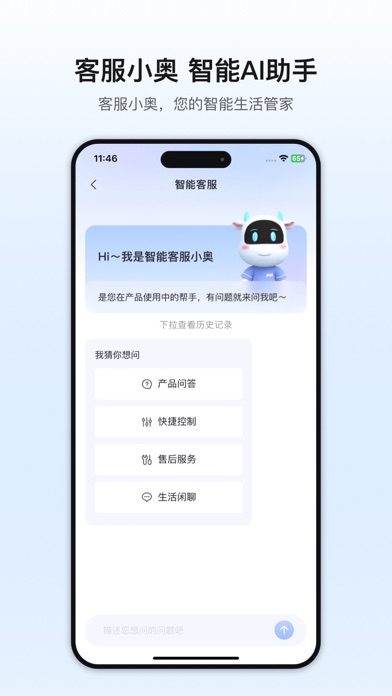
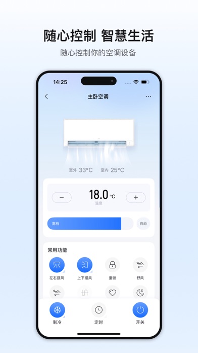
奥克斯智能家用空调拥有独特的奥克斯云计算技术。您可通过“奥克斯A+”在手机端实现远程控制奥克斯智能空调的开启和调控,查看空调运转状态、进行周定时控制,睡眠曲线控制、语音识别等功能。 界面简洁友好,仅支持奥克斯家用智能空调的使用管理,非全系列奥克斯空调。
App details
What you can learn from 奥克斯A+
Every shipping app on the App Store has gone through the same decisions you're working through right now: which screenshot goes first, what caption sits over it, which device frame to show, what color the background should be. The 5 screenshots above are 奥克斯A+'s answers to those questions — they're public, they're real, and they made it through Apple's review.
What the numbers say: 奥克斯A+ runs a light set with one background colour (#FCFCFC) carried across every screenshot — the listing reads as a single poster when the shots sit side by side in search results. The accent colour we picked up, #6C8CB4, is the one to reuse for badges, arrows and highlighted words if you borrow this look. Hit Use this style to open the editor with these exact colours and drop your own screenshot in.
Notice the first screenshot in particular. It's the one users see in search results and on the product page, and it's where most apps spend their best caption and tightest design. Look at the proportion of background to phone, where the text sits, what one thing the image is trying to communicate.
Want to see how other Lifestyle apps approach the same problem? Browse more Lifestyle apps in the showcase.
Take what works into your own screenshots
Open LaunchShots and design your App Store & Google Play screenshots — pick a device frame, drop captions, ship in minutes. Free, in your browser.
Open the screenshot editor →Apps with a similar look
Closest background + accent colours among the listings we've analysed — useful when you want to see the same palette handled by a different team.