Chart position — tracked daily by LaunchShots
Screenshot style breakdown
Sampled from 6 of 漫漫漫画-B站两不疑全集独家漫画's App Store screenshots — background, accent and theme, measured by LaunchShots (not something Apple publishes).
#FCA494 bg
#DD9082
#FCDC34 accent
#111111 text
Screenshots

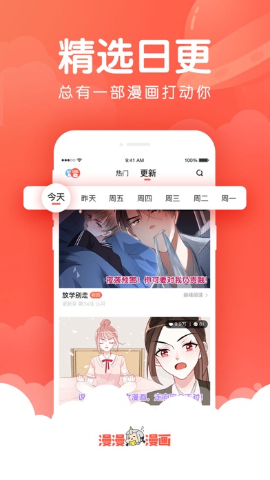

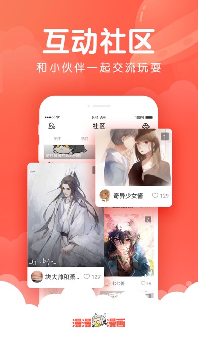

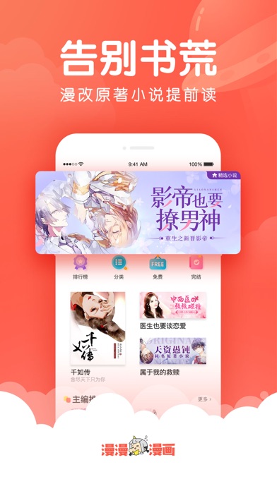
iPad screenshots


Icon palette
About this app
【软件特色】 1、海量正版资源,马不停蹄看到爽! 2、漫画分类齐全,每日编辑精选推荐! 3、条式排版颠覆传统漫画,完美配适手机的阅读体验! 4、还有只能在漫漫观看到的独家官方版权漫画哦! 【暖萌宅腐,尽在漫漫】 邪魅倜傥的王爷、暖男小奶狗、腹黑高冷的霸道男友、傲娇姐控、酷帅校草男友...... 少女——甜蜜恋爱故事 《星梦偶像计划》:闪耀星光,华丽舞台!少女心爆棚的偶像练习日记。 《榴花不及春》: 重磅古风恋爱作品,被千娇万宠长大的将军之女谢嫣一夜失恃失怙,却又因家世身份被卷入朝堂的“帝相之争”。 《两不疑》: 小说大神绿野千鹤跨界漫画,原本两看相厌、互不信任的帝后,因为意外而互换了身体。阅读量超10亿的网红古风漫画。 《胖回大唐当女神》:在追求极度消瘦的时尚里,微胖少女屡屡受挫。偶然契机下穿越到了唐朝,收割一片男神。 《皇帝的独生女》:异世重生后,奥格利帝国的皇女。 纯爱——人气男神组cp 《制服下的先生》:执事先生和小老板的同居生活 《捶地三尺有神灵》:判官奉命去人间抓回阎王,在调查中发现扑朔迷离的时间指向一个更大…
App details
What you can learn from 漫漫漫画-B站两不疑全集独家漫画
Every shipping app on the App Store has gone through the same decisions you're working through right now: which screenshot goes first, what caption sits over it, which device frame to show, what color the background should be. The 12 screenshots above are 漫漫漫画-B站两不疑全集独家漫画's answers to those questions — they're public, they're real, and they made it through Apple's review.
What the numbers say: 漫漫漫画-B站两不疑全集独家漫画 runs a light set where the background shifts from screenshot to screenshot (first shot #FCA494) — each image has to stand on its own, so the captions carry more of the story. The accent colour we picked up, #FCDC34, is the one to reuse for badges, arrows and highlighted words if you borrow this look. Hit Use this style to open the editor with these exact colours and drop your own screenshot in.
Notice the first screenshot in particular. It's the one users see in search results and on the product page, and it's where most apps spend their best caption and tightest design. Look at the proportion of background to phone, where the text sits, what one thing the image is trying to communicate.
Want to see how other Book apps approach the same problem? Browse more Book apps in the showcase.
Take what works into your own screenshots
Open LaunchShots and design your App Store & Google Play screenshots — pick a device frame, drop captions, ship in minutes. Free, in your browser.
Open the screenshot editor →Apps with a similar look
Closest background + accent colours among the listings we've analysed — useful when you want to see the same palette handled by a different team.