Chart position — tracked daily by LaunchShots
Screenshot changes — detected by LaunchShots
Screenshot style breakdown
Sampled from 6 of Циан. Недвижимость и аренда's App Store screenshots — background, accent and theme, measured by LaunchShots (not something Apple publishes).
#0454FC bg
#276BFC
#F4AC14 accent
#FFFFFF text
Screenshots


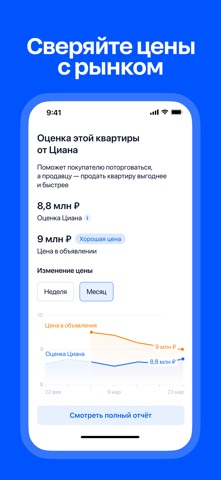


iPad screenshots


Icon palette
About this app
Циан — ведущий сервис в России для поиска, аренды, покупки и продажи недвижимости. Мечтаете купить квартиру в новостройке, снять уютный загородный дом на выходные или выгодно продать коммерческий объект? В приложении Циан собраны миллионы актуальных объявлений. Наша главная задача — сделать любую сделку с жильем простой, прозрачной и безопасной. Все операции с недвижимостью в одном месте • Покупка и продажа: огромный выбор объектов на первичном и вторичном рынках. Изучайте детальные планировки квартир от застройщиков или подбирайте готовые частные дома для всей семьи. • Долгосрочная аренда: находите квартиры, комнаты, таунхаусы и коттеджи напрямую от проверенных собственников. • Посуточный съем и отдых: планируйте отпуск или командировку. Бронируйте квартиры в центре города или арендуйте загородные виллы и дома посуточно для праздников и выходных. • Коммерческий сектор: удобный поиск…
App details
What you can learn from Циан. Недвижимость и аренда
Every shipping app on the App Store has gone through the same decisions you're working through right now: which screenshot goes first, what caption sits over it, which device frame to show, what color the background should be. The 16 screenshots above are Циан. Недвижимость и аренда's answers to those questions — they're public, they're real, and they made it through Apple's review.
What the numbers say: Циан. Недвижимость и аренда runs a mixed light-and-dark set where the background shifts from screenshot to screenshot (first shot #0454FC) — each image has to stand on its own, so the captions carry more of the story. The accent colour we picked up, #F4AC14, is the one to reuse for badges, arrows and highlighted words if you borrow this look. Hit Use this style to open the editor with these exact colours and drop your own screenshot in.
Notice the first screenshot in particular. It's the one users see in search results and on the product page, and it's where most apps spend their best caption and tightest design. Look at the proportion of background to phone, where the text sits, what one thing the image is trying to communicate.
Want to see how other Lifestyle apps approach the same problem? Browse more Lifestyle apps in the showcase.
Take what works into your own screenshots
Open LaunchShots and design your App Store & Google Play screenshots — pick a device frame, drop captions, ship in minutes. Free, in your browser.
Open the screenshot editor →Apps with a similar look
Closest background + accent colours among the listings we've analysed — useful when you want to see the same palette handled by a different team.