Screenshot style breakdown
Sampled from 6 of amehare〈アメハレ〉's App Store screenshots — background, accent and theme, measured by LaunchShots (not something Apple publishes).
#FCFCFC bg
#DDDDDD
#F44424 accent
#111111 text
Screenshots
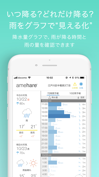
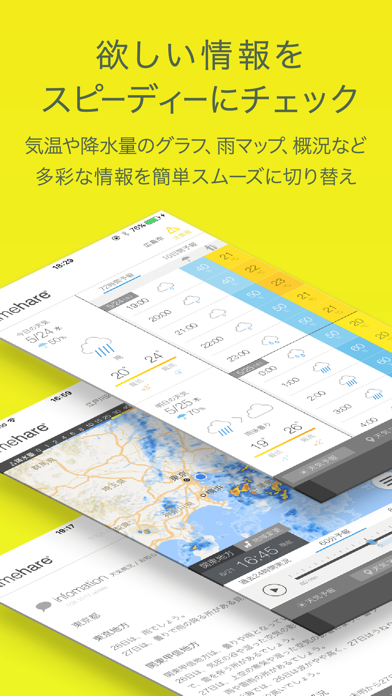
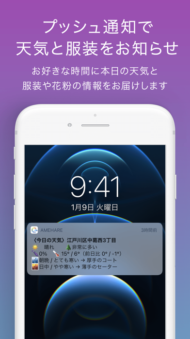
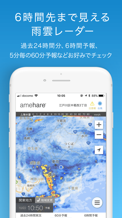
Icon palette
About this app
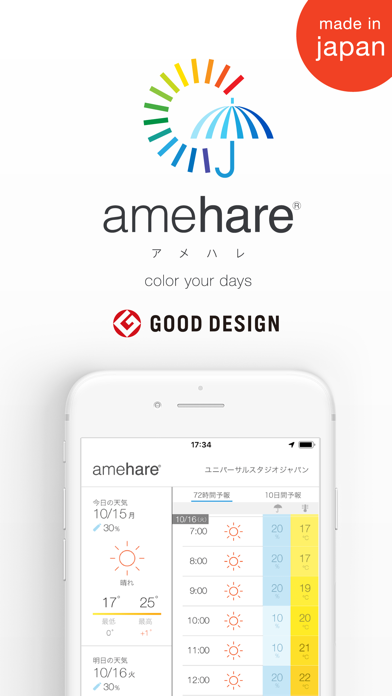
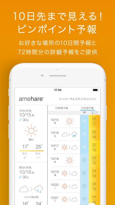
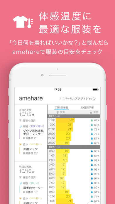
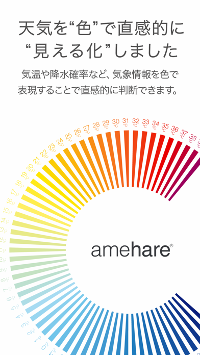
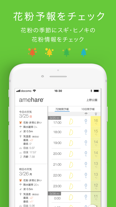
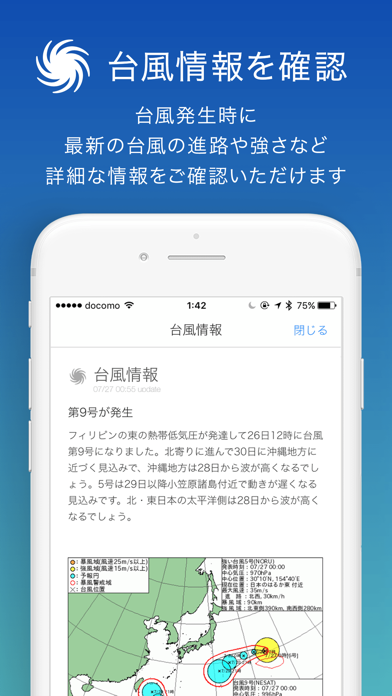
—「 グッドデザイン賞」受賞 — 《まいにち使うものだから、もっと見やすく便利な天気アプリを》使いやすく美しいデザインにこだわった国産天気予報アプリ 無料でピンポイント地点の10日間予報や、72時間分の1時間予報、24時間前から6時間先までの雨レーダーに加え、体感温度に基づいた最適な服装の目安もチェックできます 【『amehare』のおすすめポイント】 - 「グッドデザイン賞」を受賞した、使いやすさと美しさにこだわったデザイン - 今日の体感温度にぴったりな服装選びのお手伝い - 春の花粉の期間、毎日の花粉予報をチェック - 色で気温や雨などカラフルに直感的にお伝え - “体感温度”で暑さ寒さを感覚的に - 10日間先までチェックできるピンポイント予報 - 1時間ごとの体感温度や降水量などきめ細かな予報が72時間分 - 24時間前から6時間先まで、詳細に確認できる雨レーダー - 今・ココの情報がすぐ確認できるウィジット - 自宅・職場/学校に加え、10ヶ所まで地点登録可能、切り替えも簡単 - 最新の台風情報をご提供 - 全ての機能が『無料』 【『amehare』…
App details
What you can learn from amehare〈アメハレ〉
Every shipping app on the App Store has gone through the same decisions you're working through right now: which screenshot goes first, what caption sits over it, which device frame to show, what color the background should be. The 10 screenshots above are amehare〈アメハレ〉's answers to those questions — they're public, they're real, and they made it through Apple's review.
What the numbers say: amehare〈アメハレ〉 runs a light set where the background shifts from screenshot to screenshot (first shot #FCFCFC) — each image has to stand on its own, so the captions carry more of the story. The accent colour we picked up, #F44424, is the one to reuse for badges, arrows and highlighted words if you borrow this look. Hit Use this style to open the editor with these exact colours and drop your own screenshot in.
Notice the first screenshot in particular. It's the one users see in search results and on the product page, and it's where most apps spend their best caption and tightest design. Look at the proportion of background to phone, where the text sits, what one thing the image is trying to communicate.
Want to see how other Weather apps approach the same problem? Browse more Weather apps in the showcase.
Take what works into your own screenshots
Open LaunchShots and design your App Store & Google Play screenshots — pick a device frame, drop captions, ship in minutes. Free, in your browser.
Open the screenshot editor →Apps with a similar look
Closest background + accent colours among the listings we've analysed — useful when you want to see the same palette handled by a different team.