Chart position — tracked daily by LaunchShots
Screenshot changes — detected by LaunchShots
Screenshot style breakdown
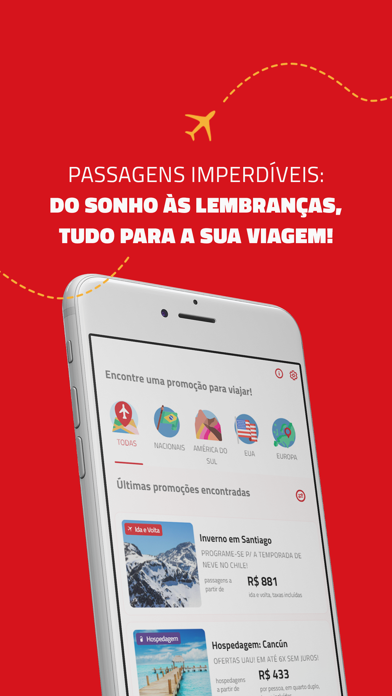
Sampled from 6 of Passagens Imperdíveis's App Store screenshots — background, accent and theme, measured by LaunchShots (not something Apple publishes).
#D4141C bg
#DA343B
#CC7C84 accent
#FFFFFF text
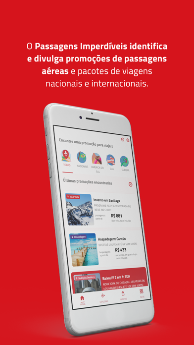
- #1O Passagens Imperdíveis identifica e divulga promoções de passagens aéreas e pacotes de vi
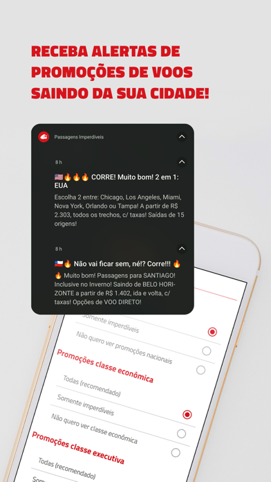
- #2RECEBA ALERTAS DE PROMOÇÕES DE VOOS SAINDO DA SUA CIDADE!
- #3Encontre passagens aéreas
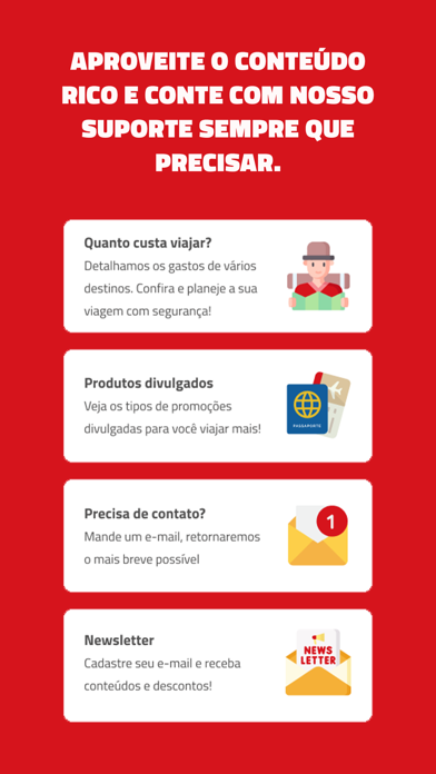
- #4APROVEITE O CONTEÚDO RICO E CONTE COM NOSSO SUPORTE SEMPRE QUE
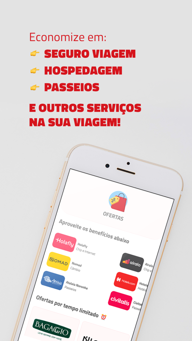
- #5Economize em: < SEGURO VIAGEM < HOSPEDAGEM
- #6PASSAGENS IMPERDIVEIS: DO SONHO AS LEMBRANCAS,
Captions read from the screenshots (OCR, may contain small errors): 6 headlines, 8.5 words on average (longest 14), mostly ALL CAPS.
Screenshots

iPad screenshots


Icon palette
About this app
Baixe gratuitamente o aplicativo do Passagens Imperdíveis, e tenha a mão as mais atualizadas informações sobre as melhores promoções de passagens aéreas, com rapidez e eficiência. Sabe aquele velho problema de perder a oportunidade de garantir sua passagem imperdível, por ter tomado conhecimento da promoção tarde demais? Está resolvido! Através desta nova ferramenta disponibilizada pelo PI, a cada nova promoção publicada em nosso site e redes sociais, serão disparados "pushs", que lhe possibilitarão identificar e comprar, na hora exata, aquela passagem pela qual tanto esperava! Aproveite e navegue por todas as demais funcionalidades do app do PI: acompanhe as atualizações em nossas redes sociais, entre em contato conosco, envie-nos suas dicas, e muito mais! E como sempre dizemos lá no PI, sinta-se em casa! O app é seu, foi feito pra você!
App details
What you can learn from Passagens Imperdíveis
Every shipping app on the App Store has gone through the same decisions you're working through right now: which screenshot goes first, what caption sits over it, which device frame to show, what color the background should be. The 11 screenshots above are Passagens Imperdíveis's answers to those questions — they're public, they're real, and they made it through Apple's review.
What the numbers say: Passagens Imperdíveis runs a mixed light-and-dark set where the background shifts from screenshot to screenshot (first shot #D4141C) — each image has to stand on its own, so the captions carry more of the story. The accent colour we picked up, #CC7C84, is the one to reuse for badges, arrows and highlighted words if you borrow this look. Hit Use this style to open the editor with these exact colours and drop your own screenshot in.
Notice the first screenshot in particular. It's the one users see in search results and on the product page, and it's where most apps spend their best caption and tightest design. Look at the proportion of background to phone, where the text sits, what one thing the image is trying to communicate.
Want to see how other Travel apps approach the same problem? Browse more Travel apps in the showcase.
Take what works into your own screenshots
Open LaunchShots and design your App Store & Google Play screenshots — pick a device frame, drop captions, ship in minutes. Free, in your browser.
Open the screenshot editor →Apps with a similar look
Closest background + accent colours among the listings we've analysed — useful when you want to see the same palette handled by a different team.