Chart position — tracked daily by LaunchShots
Screenshot style breakdown
Sampled from 6 of POCKET PARCO's App Store screenshots — background, accent and theme, measured by LaunchShots (not something Apple publishes).
#FCFCFC bg
#DDDDDD
#FC94D4 accent
#111111 text
Screenshots

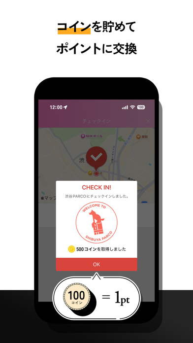
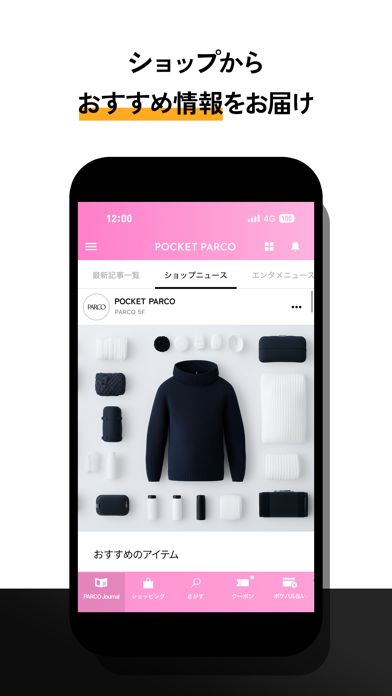
Icon palette
About this app
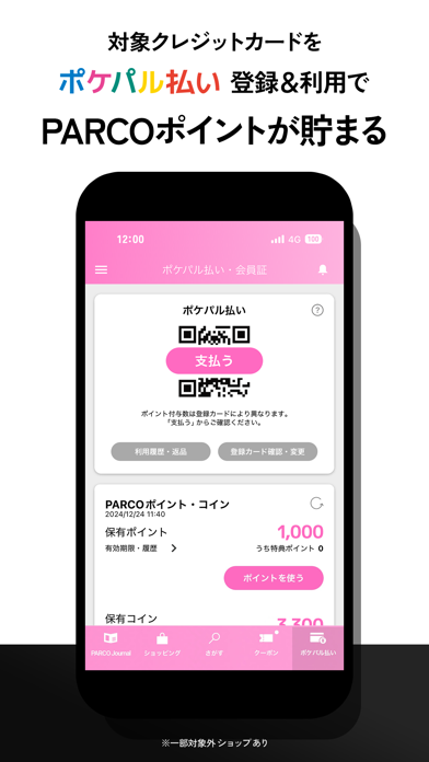
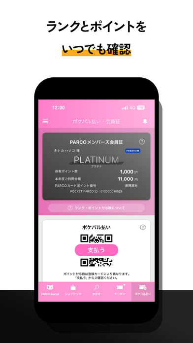
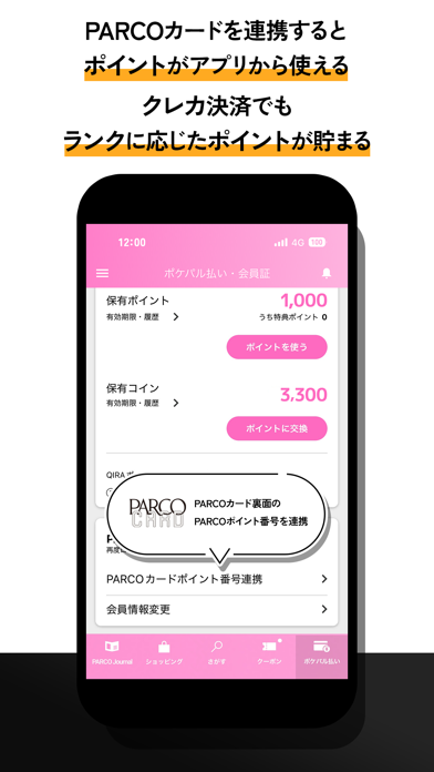
PARCOメンバーズでパルコのサービスがもっとたのしく パルコの公式アプリ「POCKET PARCO(ポケットパルコ)」 ■PARCOメンバーズについて ひとつのIDでパルコのサービスをより便利に、おトクに、楽しく体験いただくための会員サービスです。(入会費・年会費無料) 【POCKET PARCOの主な機能】 ●パルコのQRコード決済「ポケパル払い」 お手持ちのクレジットカードを「ポケパル払い」に登録いただき、全国のPARCOやONLINE PARCOでポケパル払いを利用することでPARCOポイントがその場で貯まり、さらにクレジットカードのポイントもWで貯まります。 ●PARCOポイントが貯まる&使える PARCOポイントは、全国のPARCOやONLINE PARCOでのお買い物で貯まる&使えるポイントです。PARCOカードまたはポケパル払いのご利用でポイントが貯まり、1ポイント=1円でご利用いただけます。 ●PARCOメンバーズランクの確認 PARCOメンバーズにご登録後、アプリ「POCKET PARCO」にてログインいただくと、会員証が表示され、ランクが確認できます。会員証のご提示でうけられるサ…
App details
What you can learn from POCKET PARCO
Every shipping app on the App Store has gone through the same decisions you're working through right now: which screenshot goes first, what caption sits over it, which device frame to show, what color the background should be. The 7 screenshots above are POCKET PARCO's answers to those questions — they're public, they're real, and they made it through Apple's review.
What the numbers say: POCKET PARCO runs a light set with one background colour (#FCFCFC) carried across every screenshot — the listing reads as a single poster when the shots sit side by side in search results. The accent colour we picked up, #FC94D4, is the one to reuse for badges, arrows and highlighted words if you borrow this look. Hit Use this style to open the editor with these exact colours and drop your own screenshot in.
Notice the first screenshot in particular. It's the one users see in search results and on the product page, and it's where most apps spend their best caption and tightest design. Look at the proportion of background to phone, where the text sits, what one thing the image is trying to communicate.
Want to see how other Shopping apps approach the same problem? Browse more Shopping apps in the showcase.
Take what works into your own screenshots
Open LaunchShots and design your App Store & Google Play screenshots — pick a device frame, drop captions, ship in minutes. Free, in your browser.
Open the screenshot editor →Apps with a similar look
Closest background + accent colours among the listings we've analysed — useful when you want to see the same palette handled by a different team.