Chart position — tracked daily by LaunchShots
Screenshot changes — detected by LaunchShots
Screenshot style breakdown
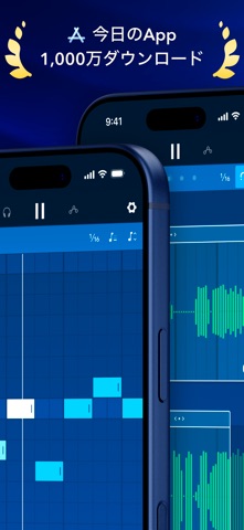
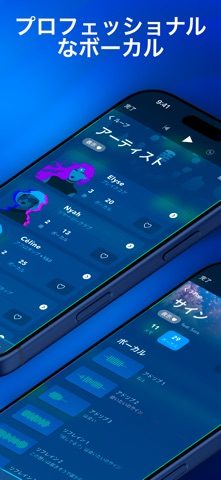
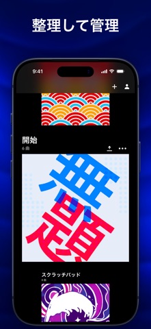
Sampled from 6 of Medly's App Store screenshots — background, accent and theme, measured by LaunchShots (not something Apple publishes).
#04042C bg
#272749
#044CA4 accent
#FFFFFF text
Screenshots




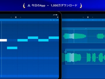
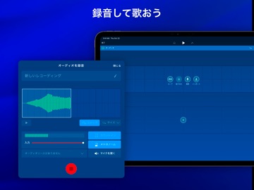
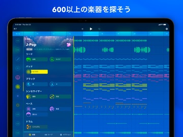
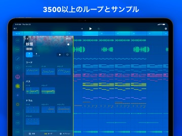
iPad screenshots
Icon palette
About this app
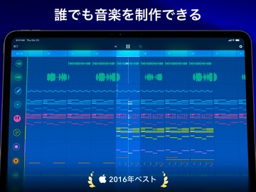
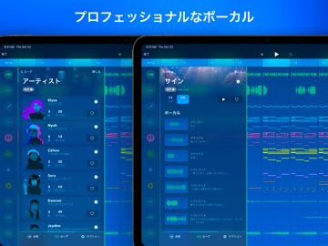
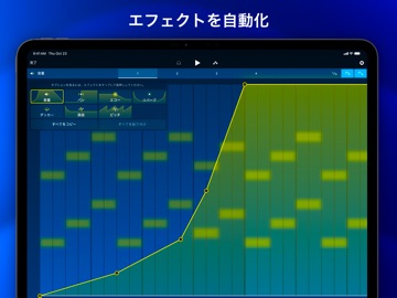
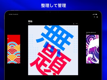
誰でも音楽を制作できる。新米のミュージシャンから経験豊富なプロデューサーまで、Medlyは誰もが音楽の才能を花咲かすことのできるアイテムを備えています。 「Best of App Store 2016」を受賞したアプリMedlyのシンプルなインターフェースには、スタジオで制作したような高いクオリティーを実現するアドバンスツールが搭載されています。まずは、17種類の楽器と100種類のループおよびサンプルが入ったスターターパックから始めてみましょう。Medlyメンバーを7日間無料で利用すれば、3500種類以上の楽器やループ、限定機能を試すことが可能です。 クリエイティブコントロール 音楽制作は壁が高いですよね。Medlyなら曲をセクションに分けるので簡単です。 音符やオーディオサンプル、セクションにループを追加することができ、それらをコピー、貼り付け、アレンジしてオリジナルソングを作ることが可能です。履歴ツールを使えば簡単に変更箇所を元に戻すことができます。 音符に一味追加 簡単な音符の追加から複雑な複数音符の編集まで、それぞれの操作が精密にデ…
App details
What you can learn from Medly
Every shipping app on the App Store has gone through the same decisions you're working through right now: which screenshot goes first, what caption sits over it, which device frame to show, what color the background should be. The 16 screenshots above are Medly's answers to those questions — they're public, they're real, and they made it through Apple's review.
What the numbers say: Medly runs a dark set where the background shifts from screenshot to screenshot (first shot #04042C) — each image has to stand on its own, so the captions carry more of the story. The accent colour we picked up, #044CA4, is the one to reuse for badges, arrows and highlighted words if you borrow this look. Hit Use this style to open the editor with these exact colours and drop your own screenshot in.
Notice the first screenshot in particular. It's the one users see in search results and on the product page, and it's where most apps spend their best caption and tightest design. Look at the proportion of background to phone, where the text sits, what one thing the image is trying to communicate.
Want to see how other Music apps approach the same problem? Browse more Music apps in the showcase.
Take what works into your own screenshots
Open LaunchShots and design your App Store & Google Play screenshots — pick a device frame, drop captions, ship in minutes. Free, in your browser.
Open the screenshot editor →Apps with a similar look
Closest background + accent colours among the listings we've analysed — useful when you want to see the same palette handled by a different team.