Screenshot changes — detected by LaunchShots
Screenshot style breakdown
Sampled from 3 of Runbit: Utforska stan's App Store screenshots — background, accent and theme, measured by LaunchShots (not something Apple publishes).
#F4F4F4 bg
#D6D6D6
#24B4E4 accent
#111111 text
Reading the caption text from the screenshots in your browser…
Screenshots


iPad screenshots
Icon palette
About this app
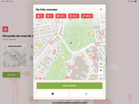
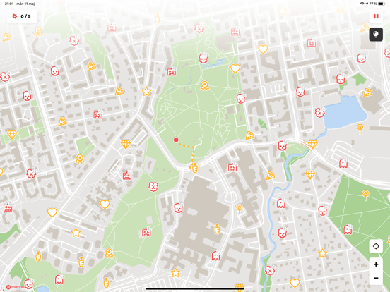
Gör varje promenad till ett äventyr. Runbit förvandlar gatorna och stigarna omkring dig till ett spel, oavsett om du är turist, hundägare, förälder eller löpare som vill ha något nytt. • UTFORSKA EN NY STAD Besöker du en ny plats? Följ stjärnorna till gator, parker och gömda hörn som du aldrig hittar med bara en karta. Sightseeing utan reseguide. • HUNDPROMENADER Gör den dagliga hundpromenaden roligare. Ta nya rundor, nosa upp nya platser och plocka stjärnor tillsammans. • SKATTJAKT FÖR BARN OCH FAMILJ Samla stjärnor på en skattjakt som ändras varje gång. Perfekt för familjeutflykter och lov. • GÅ, JOGGA ELLER SPRING Välj hur många stjärnor du ska samla eller slå klockan, eller följ en rutt med kontrollpunkter. Ta det i din egen takt till fots eller på cykel. • FLY FRÅN MONSTER Fortsätt röra dig när monstren jagar dig. Tre farter anpassas efter din nivå. Hur länge klarar du dig? •…
App details
What you can learn from Runbit: Utforska stan
Every shipping app on the App Store has gone through the same decisions you're working through right now: which screenshot goes first, what caption sits over it, which device frame to show, what color the background should be. The 5 screenshots above are Runbit: Utforska stan's answers to those questions — they're public, they're real, and they made it through Apple's review.
What the numbers say: Runbit: Utforska stan runs a light set with one background colour (#F4F4F4) carried across every screenshot — the listing reads as a single poster when the shots sit side by side in search results. The accent colour we picked up, #24B4E4, is the one to reuse for badges, arrows and highlighted words if you borrow this look. Hit Use this style to open the editor with these exact colours and drop your own screenshot in.
Notice the first screenshot in particular. It's the one users see in search results and on the product page, and it's where most apps spend their best caption and tightest design. Look at the proportion of background to phone, where the text sits, what one thing the image is trying to communicate.
Want to see how other Health & Fitness apps approach the same problem? Browse more Health & Fitness apps in the showcase.
Take what works into your own screenshots
Open LaunchShots and design your App Store & Google Play screenshots — pick a device frame, drop captions, ship in minutes. Free, in your browser.
Open the screenshot editor →Apps with a similar look
Closest background + accent colours among the listings we've analysed — useful when you want to see the same palette handled by a different team.