Screenshot style breakdown
Sampled from 4 of 安否確認アプリ's App Store screenshots — background, accent and theme, measured by LaunchShots (not something Apple publishes).
#F4F4EC bg
#D6D6CF
#3C74B4 accent
#111111 text
Screenshots

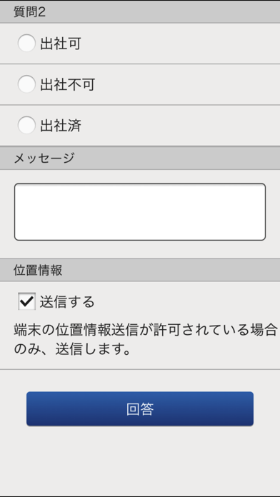
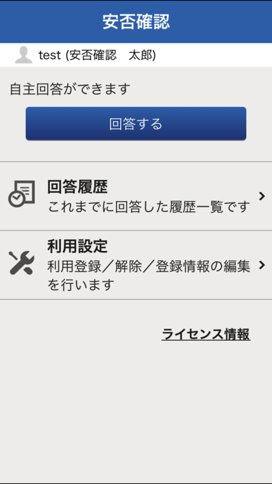
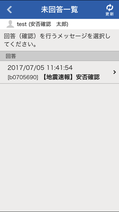
Icon palette
About this app
本アプリケーションは、富士通株式会社が提供する「緊急連絡/安否確認サービス」にて利用できます。 利用者は本サービスの緊急連絡や安否確認の通知を本アプリケーションで受け付けることができます。また、通知に対して安否状況等を回答することができます。 *「緊急連絡/安否確認サービス」とは、日本国内の大規模地震や自然災害・緊急事態発生時に、自動送信的または管理者により利用者へ一斉に緊急連絡/安否確認を行うサービスです。 本アプリケーションは、富士通株式会社の「緊急連絡/安否確認サービス」をご契約いただいたお客様でご利用いただけます。 本サービスの詳細、ご契約につきましては、弊社「緊急連絡/安否確認サービス」紹介サイトもしくは、営業までお問い合わせ下さい。 【機能】 1)緊急連絡/安否確認の受信 各利用者宛に発信された緊急連絡/安否確認の通知を受け付けることができます。 2)回答登録 受け付けた緊急連絡/安否確認の通知に対して安否状況などの回答を登録することができます。 3)履歴の確認 本人宛に届いた緊急連…
App details
What you can learn from 安否確認アプリ
Every shipping app on the App Store has gone through the same decisions you're working through right now: which screenshot goes first, what caption sits over it, which device frame to show, what color the background should be. The 4 screenshots above are 安否確認アプリ's answers to those questions — they're public, they're real, and they made it through Apple's review.
What the numbers say: 安否確認アプリ runs a light set with one background colour (#F4F4EC) carried across every screenshot — the listing reads as a single poster when the shots sit side by side in search results. The accent colour we picked up, #3C74B4, is the one to reuse for badges, arrows and highlighted words if you borrow this look. Hit Use this style to open the editor with these exact colours and drop your own screenshot in.
Notice the first screenshot in particular. It's the one users see in search results and on the product page, and it's where most apps spend their best caption and tightest design. Look at the proportion of background to phone, where the text sits, what one thing the image is trying to communicate.
Want to see how other Business apps approach the same problem? Browse more Business apps in the showcase.
Take what works into your own screenshots
Open LaunchShots and design your App Store & Google Play screenshots — pick a device frame, drop captions, ship in minutes. Free, in your browser.
Open the screenshot editor →Apps with a similar look
Closest background + accent colours among the listings we've analysed — useful when you want to see the same palette handled by a different team.