Chart position — tracked daily by LaunchShots
Screenshot changes — detected by LaunchShots
Screenshot style breakdown
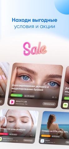
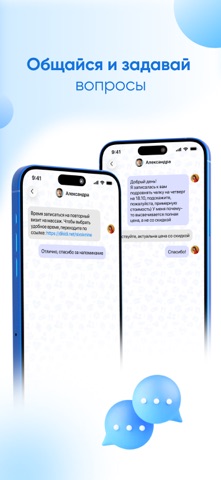
Sampled from 6 of DIKIDI Online's App Store screenshots — background, accent and theme, measured by LaunchShots (not something Apple publishes).
#FCFCFC bg
#DDDDDD
#1C9CFC accent
#111111 text
Screenshots




Icon palette
About this app
Откройте для себя DIKIDI Online – идеальный способ записаться к любимому специалисту или компании без лишних усилий! С DIKIDI вы получаете: 1. Мгновенную запись онлайн Выбирайте мастера, услугу и время прямо из актуального расписания, без необходимости звонить или писать. 2. Лёгкий поиск Находите запись в салоны красоты или на другие услуги по геопозиции, категориям, рейтингам, ценам и другим критериям. Всё, что вам нужно, – на расстоянии одного клика! 3. Выгодные предложения Воспользуйтесь акциями и специальными предложениями, чтобы сэкономить на любимых услугах! 4. Напоминания о визитах Напоминания помогут вам не забыть о важных записях и быть вовремя. 5. Управление записями Записывайтесь, редактируйте или отменяйте визиты без проблем. 6. Бонусы и скидки В личном кабинете вы найдёте информацию о кэшбэке, сертификатах и персональных скидках. 7. Чаты Общайтесь со специалистами п…
App details
What you can learn from DIKIDI Online
Every shipping app on the App Store has gone through the same decisions you're working through right now: which screenshot goes first, what caption sits over it, which device frame to show, what color the background should be. The 8 screenshots above are DIKIDI Online's answers to those questions — they're public, they're real, and they made it through Apple's review.
What the numbers say: DIKIDI Online runs a light set with one background colour (#FCFCFC) carried across every screenshot — the listing reads as a single poster when the shots sit side by side in search results. The accent colour we picked up, #1C9CFC, is the one to reuse for badges, arrows and highlighted words if you borrow this look. Hit Use this style to open the editor with these exact colours and drop your own screenshot in.
Notice the first screenshot in particular. It's the one users see in search results and on the product page, and it's where most apps spend their best caption and tightest design. Look at the proportion of background to phone, where the text sits, what one thing the image is trying to communicate.
Want to see how other Productivity apps approach the same problem? Browse more Productivity apps in the showcase.
Take what works into your own screenshots
Open LaunchShots and design your App Store & Google Play screenshots — pick a device frame, drop captions, ship in minutes. Free, in your browser.
Open the screenshot editor →Apps with a similar look
Closest background + accent colours among the listings we've analysed — useful when you want to see the same palette handled by a different team.