Chart position — tracked daily by LaunchShots
Screenshot style breakdown
Sampled from 5 of 航空波浪気象情報's App Store screenshots — background, accent and theme, measured by LaunchShots (not something Apple publishes).
#FCFCFC bg
#DDDDDD
#24549C accent
#111111 text
Reading the caption text from the screenshots in your browser…
Screenshots
Icon palette
About this app
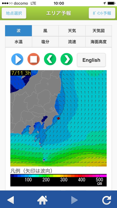
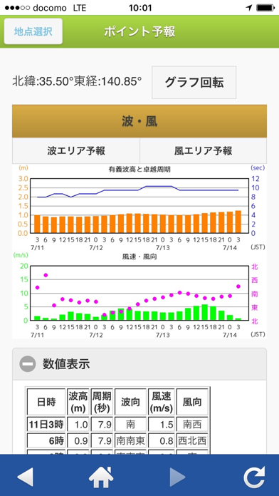
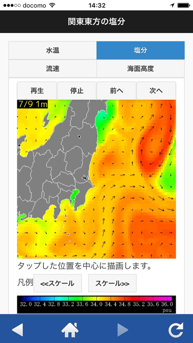
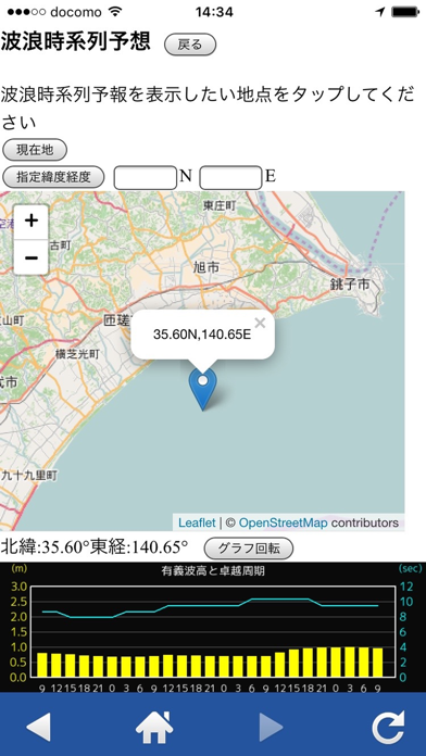
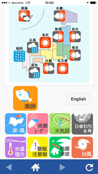
ーーー2016/11/29 お願いーーーーーーーーーーーーーー ○アプリを立ち上げる際、自動的に広告先に飛んでしまう不具合が発生しました。 現在、改善しましたが、一部機種で同様の不具合が発生しているようです。 該当する方は、お手数ですが 下記まで ご利用機種、OS をご連絡ください。 mobile@imoc.co.jp よろしくお願い致します。 ーーーーーーーーーーーーーーーーーーーーーーーーーー 国際気象海洋株式会社が提供する漁業・航空・工事管理・防災・マリンスカイレジャー向けの有料の気象情報アプリです。 通常の天気予報等の情報の他に多彩な各種気象情報を提供します。 ■全国各地のさまざまな気象・海象情報をご覧になれます。 特に、波浪予想図は、多くの方々から支持をいただいております。波浪の時系列予想は全世界(全球)に対応しています。 ■主な気象情報(無料) ・航空向け情報…METAR電文やTAF電文など ・防災関連の情報…土壌雨量指数、台風経路図など ・天気予報…今日明日・週間天気予報 ・天気図…地上天気図、構想天気図など ・アメダ…
App details
What you can learn from 航空波浪気象情報
Every shipping app on the App Store has gone through the same decisions you're working through right now: which screenshot goes first, what caption sits over it, which device frame to show, what color the background should be. The 5 screenshots above are 航空波浪気象情報's answers to those questions — they're public, they're real, and they made it through Apple's review.
What the numbers say: 航空波浪気象情報 runs a light set with one background colour (#FCFCFC) carried across every screenshot — the listing reads as a single poster when the shots sit side by side in search results. The accent colour we picked up, #24549C, is the one to reuse for badges, arrows and highlighted words if you borrow this look. Hit Use this style to open the editor with these exact colours and drop your own screenshot in.
Notice the first screenshot in particular. It's the one users see in search results and on the product page, and it's where most apps spend their best caption and tightest design. Look at the proportion of background to phone, where the text sits, what one thing the image is trying to communicate.
Want to see how other Weather apps approach the same problem? Browse more Weather apps in the showcase.
Take what works into your own screenshots
Open LaunchShots and design your App Store & Google Play screenshots — pick a device frame, drop captions, ship in minutes. Free, in your browser.
Open the screenshot editor →Apps with a similar look
Closest background + accent colours among the listings we've analysed — useful when you want to see the same palette handled by a different team.