Chart position — tracked daily by LaunchShots
Screenshot changes — detected by LaunchShots
Screenshot style breakdown
Sampled from 3 of 中央天气预报-精准预报实时天气变化's App Store screenshots — background, accent and theme, measured by LaunchShots (not something Apple publishes).
#04A4FC bg
#27B0FC
#2C5C94 accent
#FFFFFF text
Screenshots

Icon palette
About this app
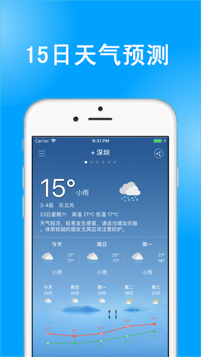
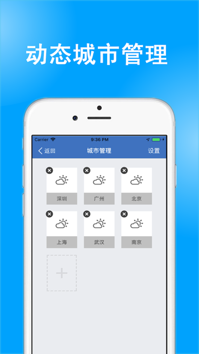
天气预报为您提供15天精准天气预报,实时空气质量及生活指数;新增万年历黄历,宜忌吉日、农历节气一目了然,天气与传统黄历一站搞定,从容应对各类天气与生活决策。 【产品简介】 包含国内300多个城市天气信息,采用国内多家气象机构数据,天气预报信息准确全面,24小时预报、未来十五天天气预报等。气压、湿度、能见度是您户外钓鱼的好帮手!空气质量、污染指数、温度趋势、pm2.5,空气质量指数等更加丰富、精准天气信息!提供穿衣、洗车、紫外线、感冒、运动、旅游等生活指数,是您日常生活、出行旅游的必备天气预报APP! 【新增·黄历万年历】 * 今日黄历:农历日期、生肖、宜忌一屏展示,天气与黄历联动提醒,晴天宜出行、雨天记得带伞。 * 万年历月视图:农历、节气、法定节假日/调休一目了然,翻页速查任意月份。 * 吉日速查:搬家、开业、结婚等分类吉日,未来30天一键筛选,出门办事先看黄历。 * 我的生肖:设置生肖,查看每日运势小提示。 * 农历提醒:开启后每日黄历重点提前提醒,不错过吉日。 【天气功能】 * 空气质量指数:空气指数界面升级,五天…
App details
What you can learn from 中央天气预报-精准预报实时天气变化
Every shipping app on the App Store has gone through the same decisions you're working through right now: which screenshot goes first, what caption sits over it, which device frame to show, what color the background should be. The 3 screenshots above are 中央天气预报-精准预报实时天气变化's answers to those questions — they're public, they're real, and they made it through Apple's review.
What the numbers say: 中央天气预报-精准预报实时天气变化 runs a dark set with one background colour (#04A4FC) carried across every screenshot — the listing reads as a single poster when the shots sit side by side in search results. The accent colour we picked up, #2C5C94, is the one to reuse for badges, arrows and highlighted words if you borrow this look. Hit Use this style to open the editor with these exact colours and drop your own screenshot in.
Notice the first screenshot in particular. It's the one users see in search results and on the product page, and it's where most apps spend their best caption and tightest design. Look at the proportion of background to phone, where the text sits, what one thing the image is trying to communicate.
Want to see how other Weather apps approach the same problem? Browse more Weather apps in the showcase.
Take what works into your own screenshots
Open LaunchShots and design your App Store & Google Play screenshots — pick a device frame, drop captions, ship in minutes. Free, in your browser.
Open the screenshot editor →Apps with a similar look
Closest background + accent colours among the listings we've analysed — useful when you want to see the same palette handled by a different team.